Chapter 5 Multivariate exploratory analysis
5.1 Notation
Goal: Analyze \(p\) variables, all of which are entering the analysis equally without particular direction or weights.
Basis: Observations of the \(p\) variables for \(n\) units. Each observation can be written as a \(p\)-dimensional vector
\[x_i \quad = \quad (x_{i1}, \dots, x_{ip})^\top.\]
The entire data can be represented by an \(n \times p\) matrix
\[ X \quad = \quad \left( \begin{array}{ccc} x_{11} & \dots & x_{1p} \\ \vdots & \ddots & \vdots \\ x_{n1} & \dots & x_{np} \end{array} \right). \]
Remark: It is possible that \(n \gg p\) (as in typical regression analyses), but also \(n \ll p\). There are also cases where it makes sense to exchange the roles of \(n\) and \(p\), i.e., considering \(X^\top\) instead of \(X\).
Assumption: Initially, we assume that all variables in \(X\) are quantitative.
Example: For the tourists from the GSA data an aggregated part of the data is considered. For each of the summer activities considered we compute the proportion of tourists from each country of origin that have participated in this activity. This yields a data matrix \(X\) from \(n = 15\) countries for \(p = 8\) different summer activities.
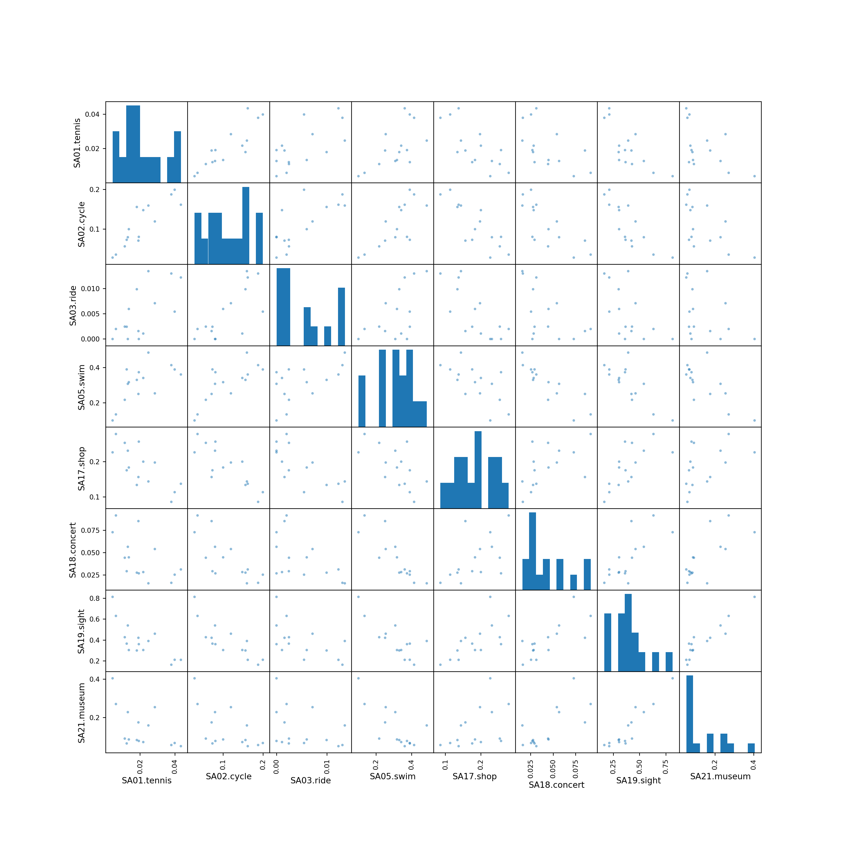
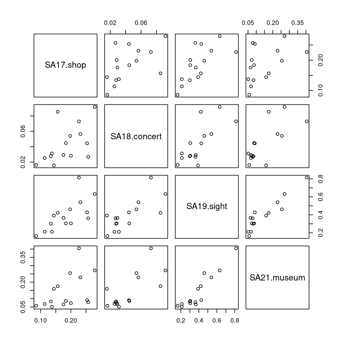
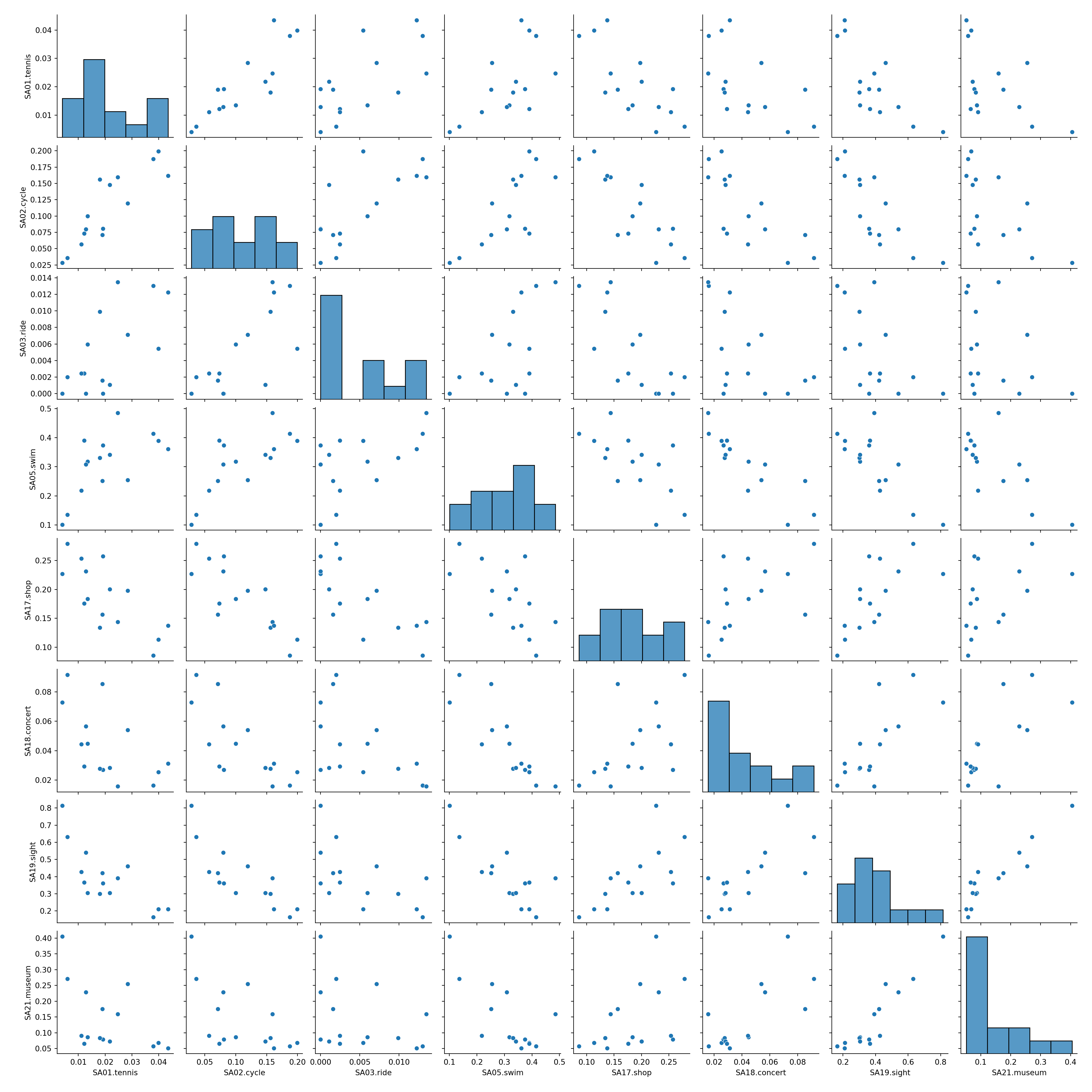
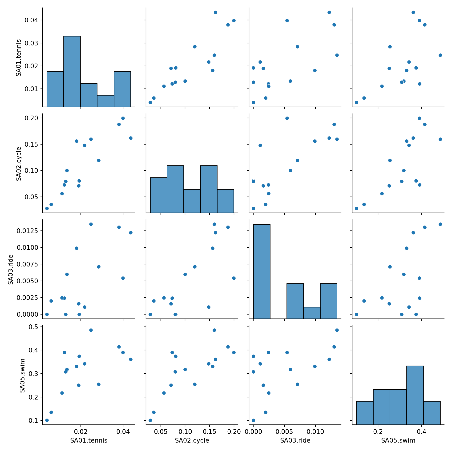
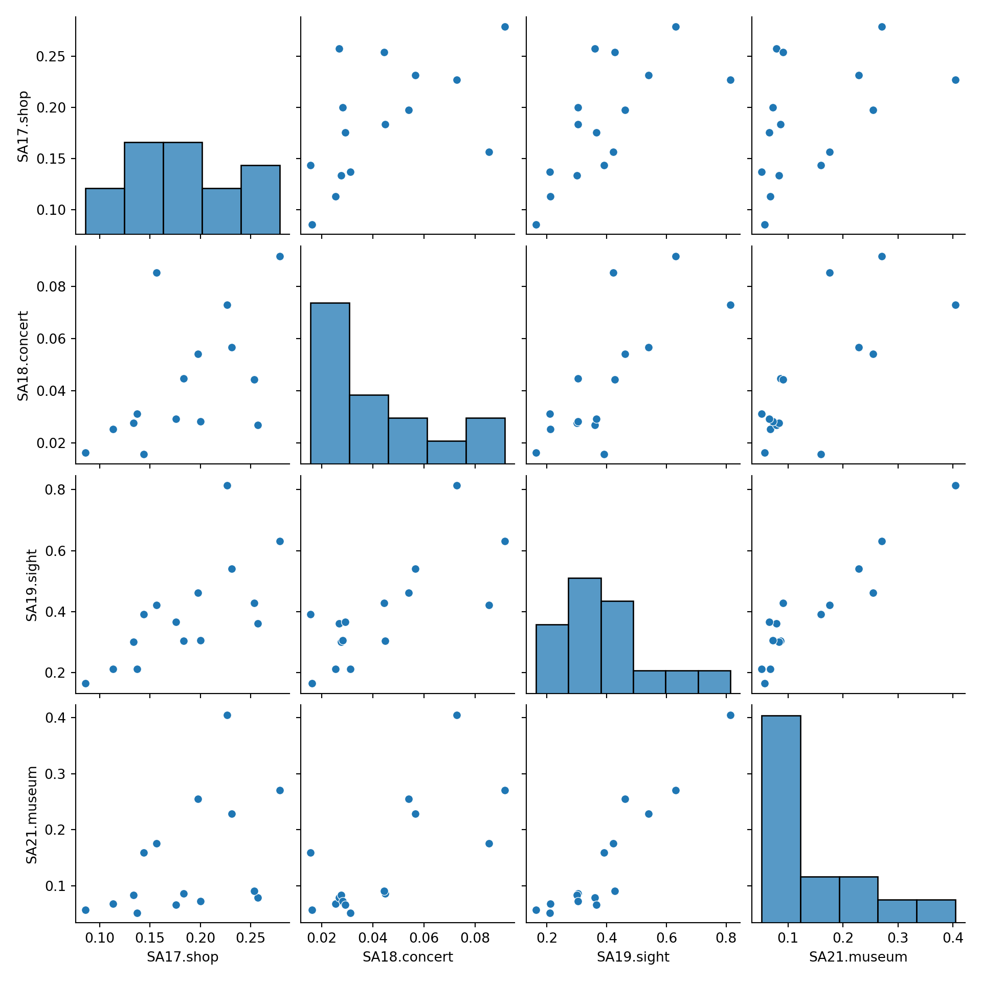
5.2 Pairwise scatter plots
Idea: A very simple method for gaining a first overview of a data matrix – at least if \(p\) is not too large - are pairwise scatter plots, also known as a scatter plot matrix.
Details: Each possible combination of the \(p\) variables is visualized by a scatter plot (with \(n\) observations) and arranged in a matrix layout. Mathematically, this corresponds to a projection of the data from \(\mathbb{R}^p\) into \(\mathbb{R}^2\) along the axes.


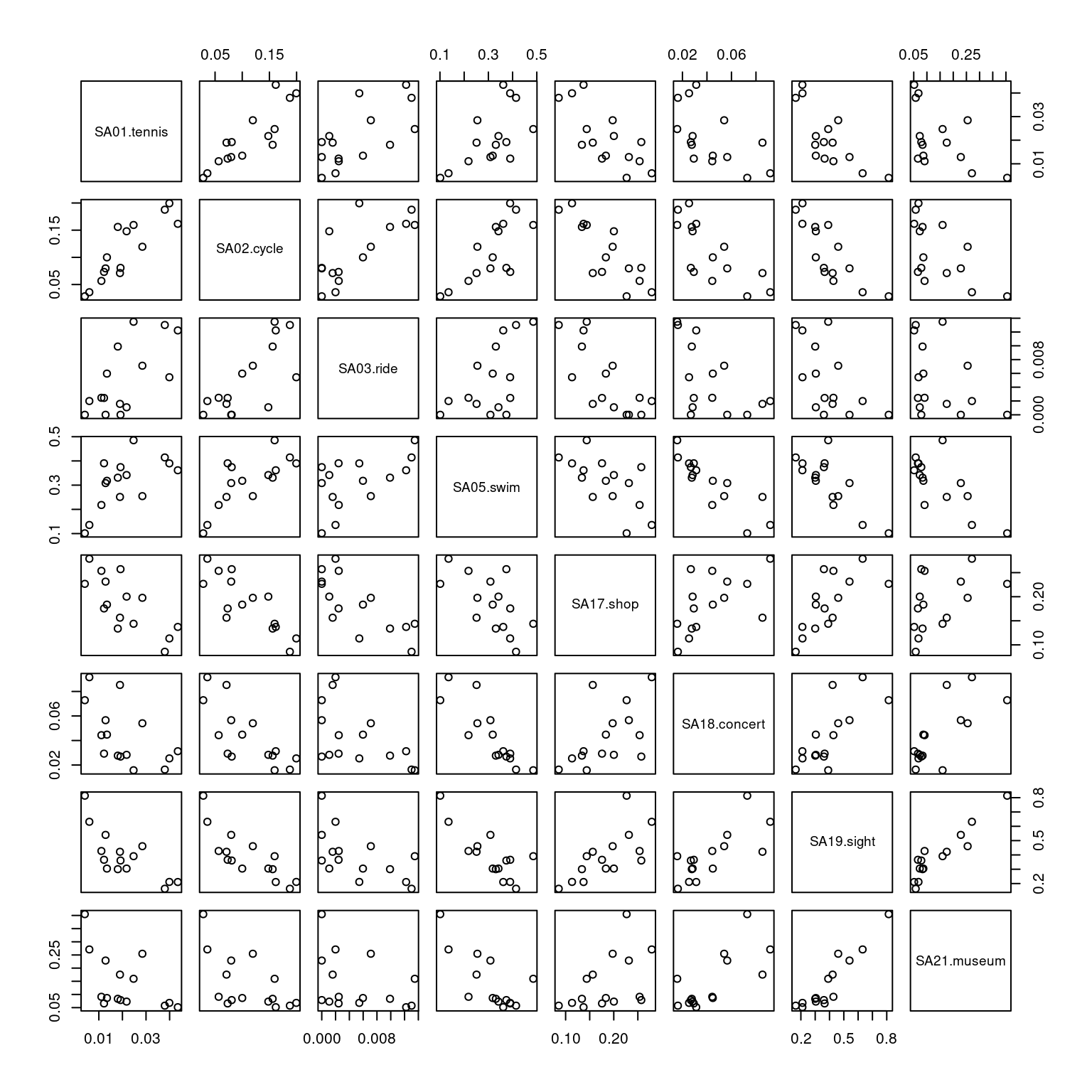
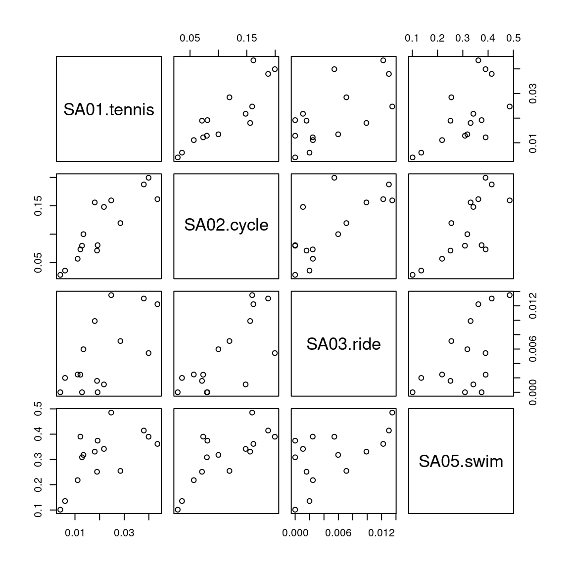

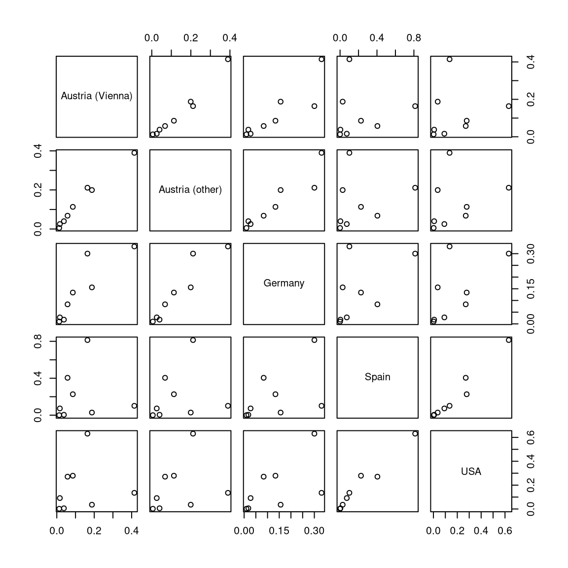
For illustrating various multivariate exploratory visualizations, we employ a data set with moderately small number of observations \(n\) and moderately small number of variables \(p\). Namely the interest in \(p =8\) summer activities by \(n = 15\) countries of origin from the Guest Survey Austria are used. This data set has already been prepared in Chapter 3 Aggregating GSA - R and Aggregating GSA - Python from the raw tourist-level data, and it can be downloaded directly as gsa-country.csv or gsa-country.rda.
Python
# Make sure that the required libraries are installed.
# Import the necessary libraries and classes:
import pandas as pd
import numpy as np
from matplotlib import pyplot as plt
import matplotlib.colors as mcolors
import seaborn as sns

pd.set_option("display.precision", 4) # Set display precision to 4 digits in pandas and numpy.
Load the gsa-country.csv dataset. See Chapter 3
for the data preprocessing and general advice for data management.
Here, we read the data first without an index column, i.e., using all columns from the
CSV data as regular variables with a default numeric index. (However, recall that this only
works correctly because all columns in the CSV are indeed named.)
##             Country  SA01.tennis  ...  SA19.sight  SA21.museum
## 0  Austria (Vienna)       0.0380  ...      0.1638       0.0575
## 1   Austria (other)       0.0399  ...      0.2112       0.0680
## 2           Belgium       0.0134  ...      0.3045       0.0866
## 3           Denmark       0.0192  ...      0.3608       0.0787
## 4            France       0.0190  ...      0.4218       0.1754
##
## [5 rows x 9 columns]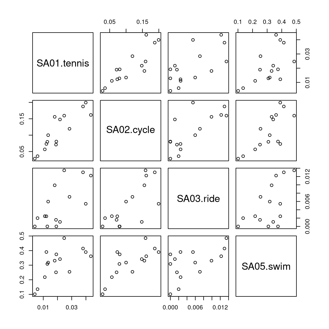
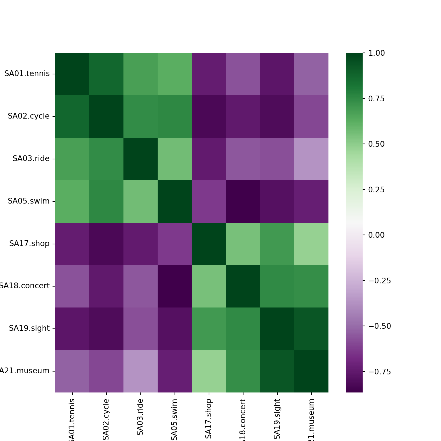
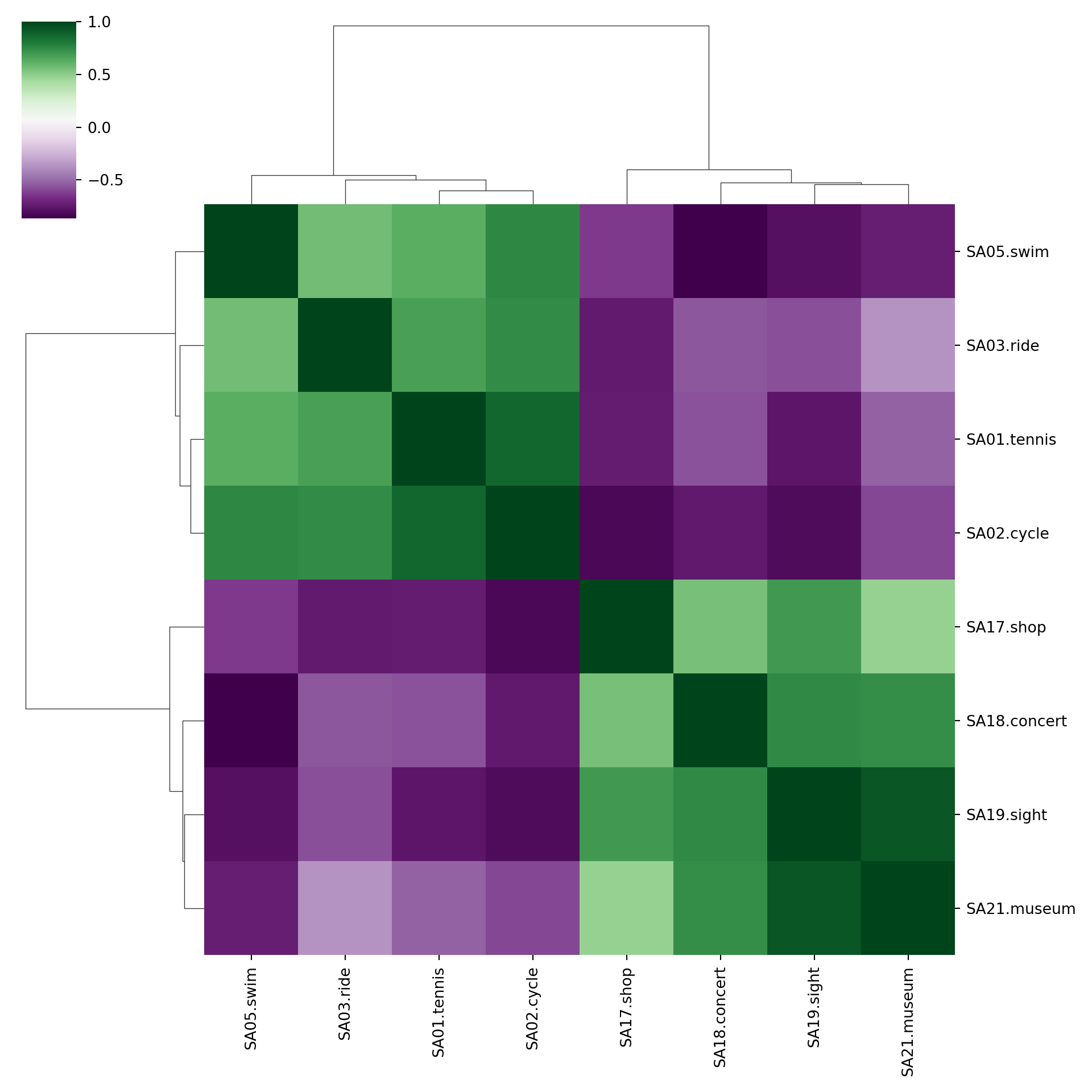
5.3 Correlation heatmaps
Problem: Number of pairwise scatterplots increases quadratically.
Hence: Most details get obscured and only obvious patterns can be detected.
Alternative: Replace each scatterplot by a color-coded rectangle of the corresponding correlation.
Variations:
- Color choice is important. Red-green seems intuitive but is challenging for viewers with color vision deficiencies. Better use purple-green or red-blue.
- Variable ordering is crucial for detecting patterns, often chosen by so-called hierarchical clustering methods.
- Graphical elements can be varied, e.g., ellipses rather than rectangles or printed correlations, or different elements on opposite triangles.
R
cor_gsa <- cor(gsa)
cor_col <- hcl.colors(33, "Purple-Green")
heatmap(cor_gsa, col = cor_col, zlim = c(-1, 1), symm = TRUE, margins = c(8, 8), Rowv = NA)
legend("right", c(1, rep("", 15), 0, rep("", 15), -1), fill = rev(cor_col),
  bty = "n", border = "transparent", y.intersp = 0.5)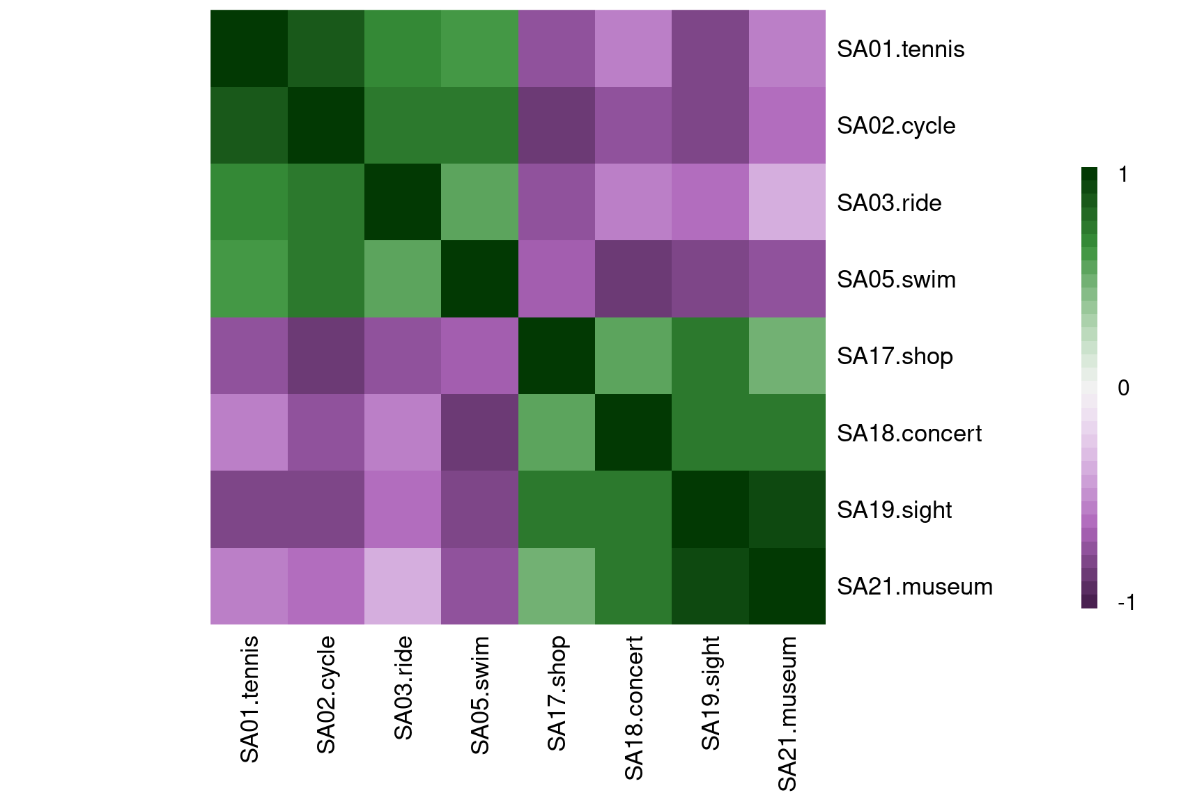
heatmap(cor_gsa, col = cor_col, zlim = c(-1, 1), symm = TRUE, margins = c(8, 8))
legend("right", c(1, rep("", 15), 0, rep("", 15), -1), fill = rev(cor_col),
  bty = "n", border = "transparent", y.intersp = 0.5)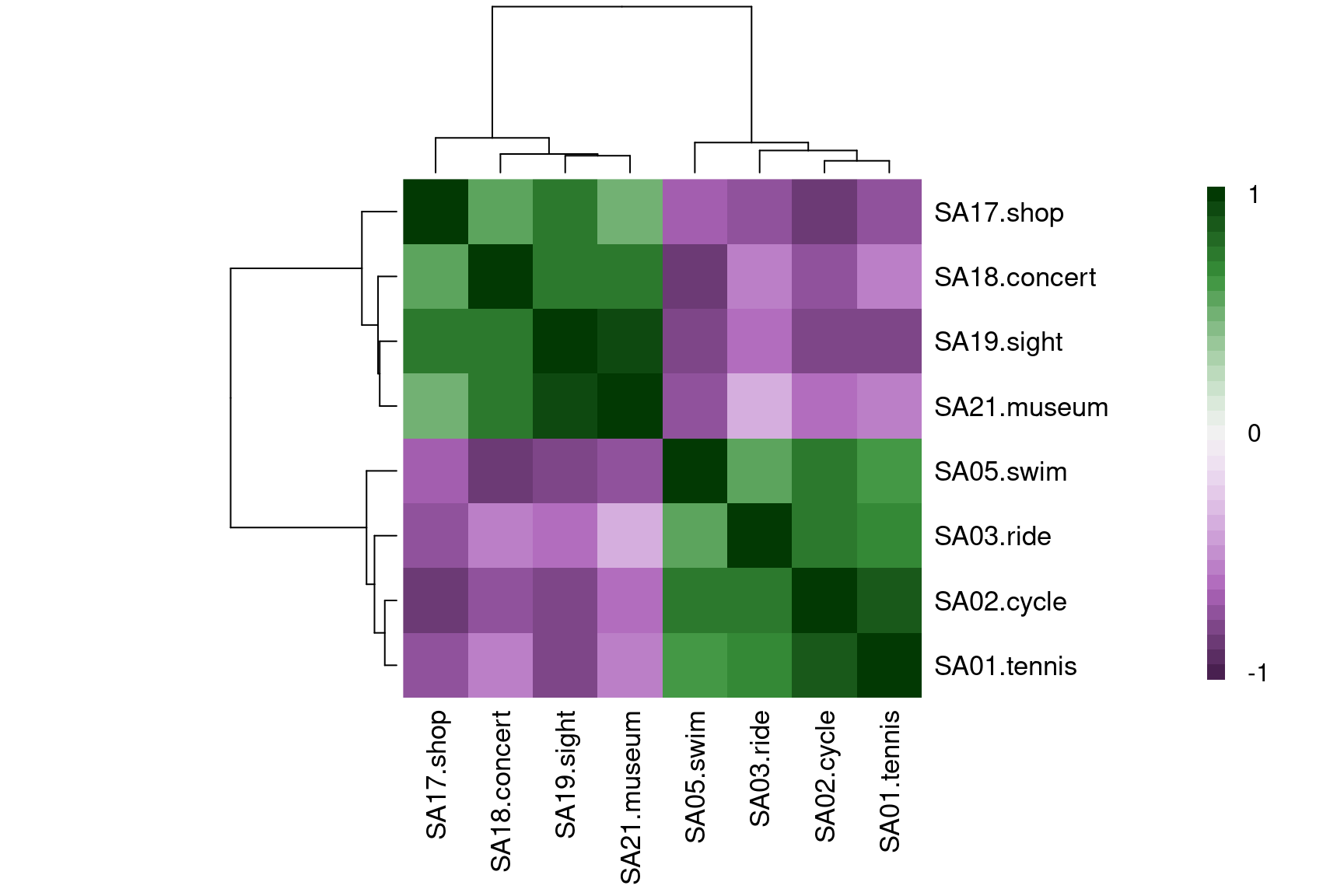
5.4 Standardization: Unit interval
Idea: Unlike scatter plots some visualization techniques necessitate observations on a standardized scale. One commonly-used approach is to standardize all variables to the unit interval \([0, 1]\).
Details: To transform a given matrix \(X\) to a matrix \(\tilde X\) with observations in the unit interval \([0, 1]\), each column/variable is scaled in the following way: The maximum is mapped to \(1\), the minimum to \(0\) and all other values correspond to proportions of the distance between the maximum and minimum.
Formally: Compute the minimum \(\mathit{min}_j\) and maximum \(\mathit{max}_j\) for each of the columns \(j = 1, \dots, p\). The standardized observations \(\tilde x_{ij}\) are then defined as the distance from the minimum divided by the range for the corresponding column.
\[\begin{eqnarray*} \mathit{min}_j & = & \min_{i = 1, \dots, n} x_{ij} \\ \mathit{max}_j & = & \max_{i = 1, \dots, n} x_{ij} \\ \tilde x_{ij} & = & \frac{x_{ij} - \mathit{min}_j}{\mathit{max}_j - \mathit{min}_j} \end{eqnarray*}\]
Example:
Original data (selection of observations/variables):
##                  SA01.tennis SA05.swim SA17.shop SA21.museum
## Austria (Vienna)       0.038     0.414     0.086       0.057
## Spain                  0.004     0.101     0.227       0.405
Minima/maxima (across all observations for a variable):
##                  SA01.tennis SA05.swim SA17.shop SA21.museum
## min                    0.004     0.101     0.086       0.052
## max                    0.043     0.485     0.279       0.405
Data scaled to the unit interval:
##                  SA01.tennis SA05.swim SA17.shop SA21.museum
## Austria (Vienna)       0.860     0.815     0.000       0.017
## Spain                  0.000     0.000     0.730       1.000
5.5 Parallel coordinates
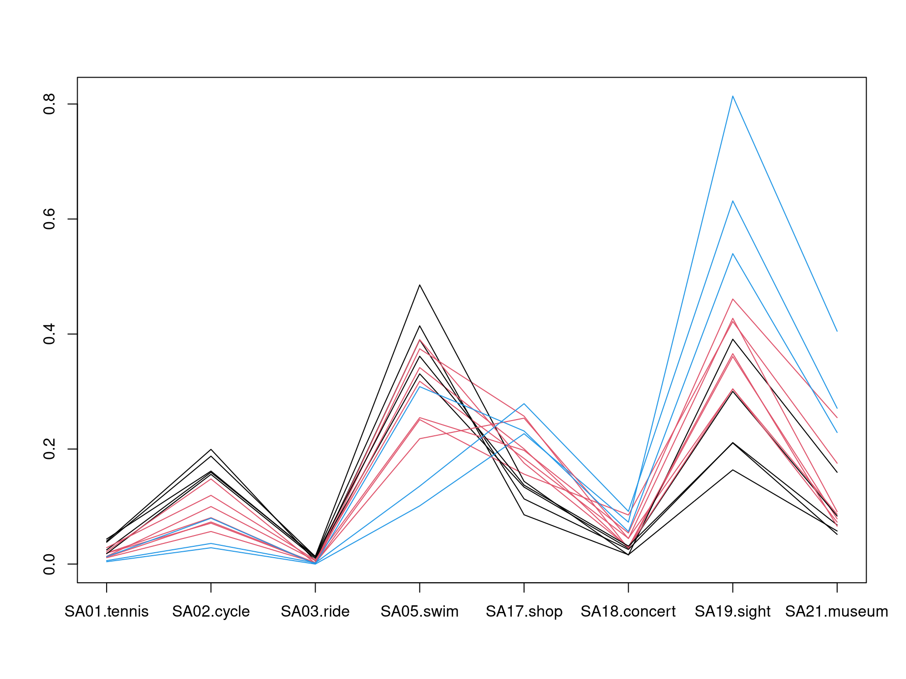
Idea: Another simple visualization of multivariate data is to draw a polygonal line across parallel axes for each observation/row \(\tilde x_i\). This is known as a parallel coordinates display.
Remarks:
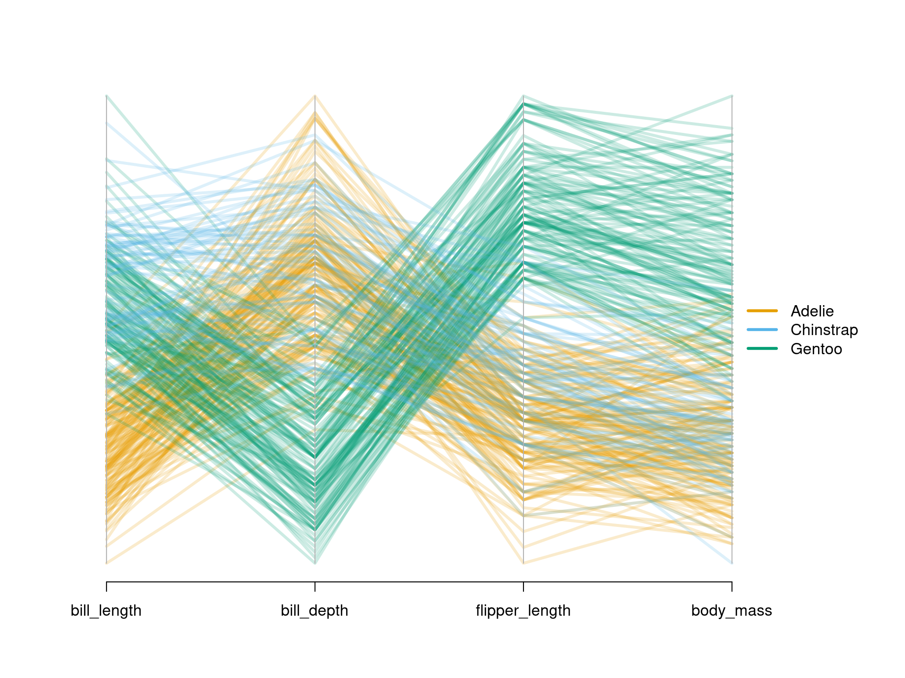
- Patterns in these plots can often be emphasized by shading the lines with respect to another variable or a prespecified grouping.
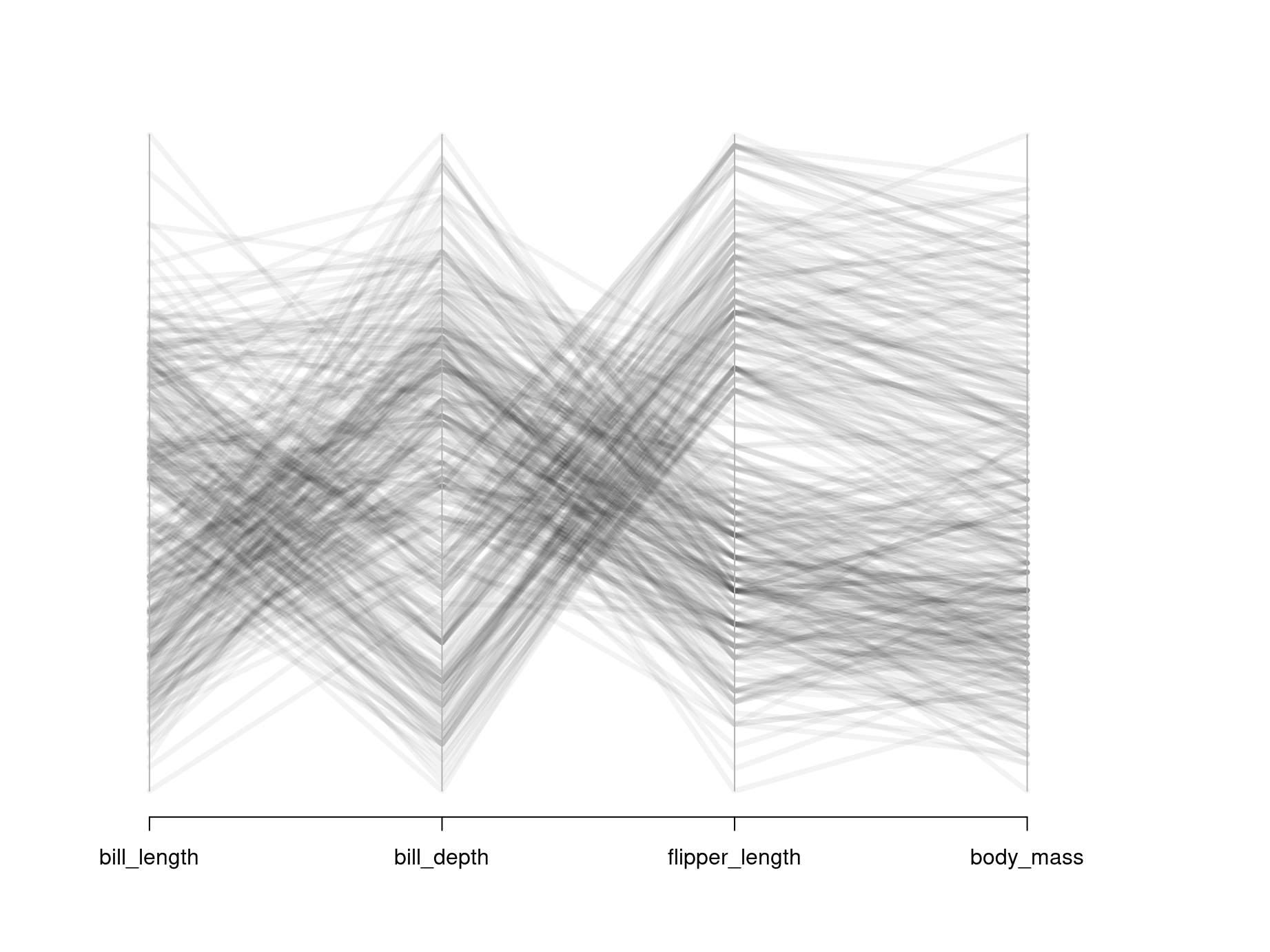
- Also, if the number of observations \(n\) is large, then it is often useful to draw semi-transparent lines so that patterns emerge from overplotting common trajectories.
- If all variables are measured on comparable scales it may also be feasible to display the original observations \(x_i\) instead of the scaled \(\tilde x_i\).
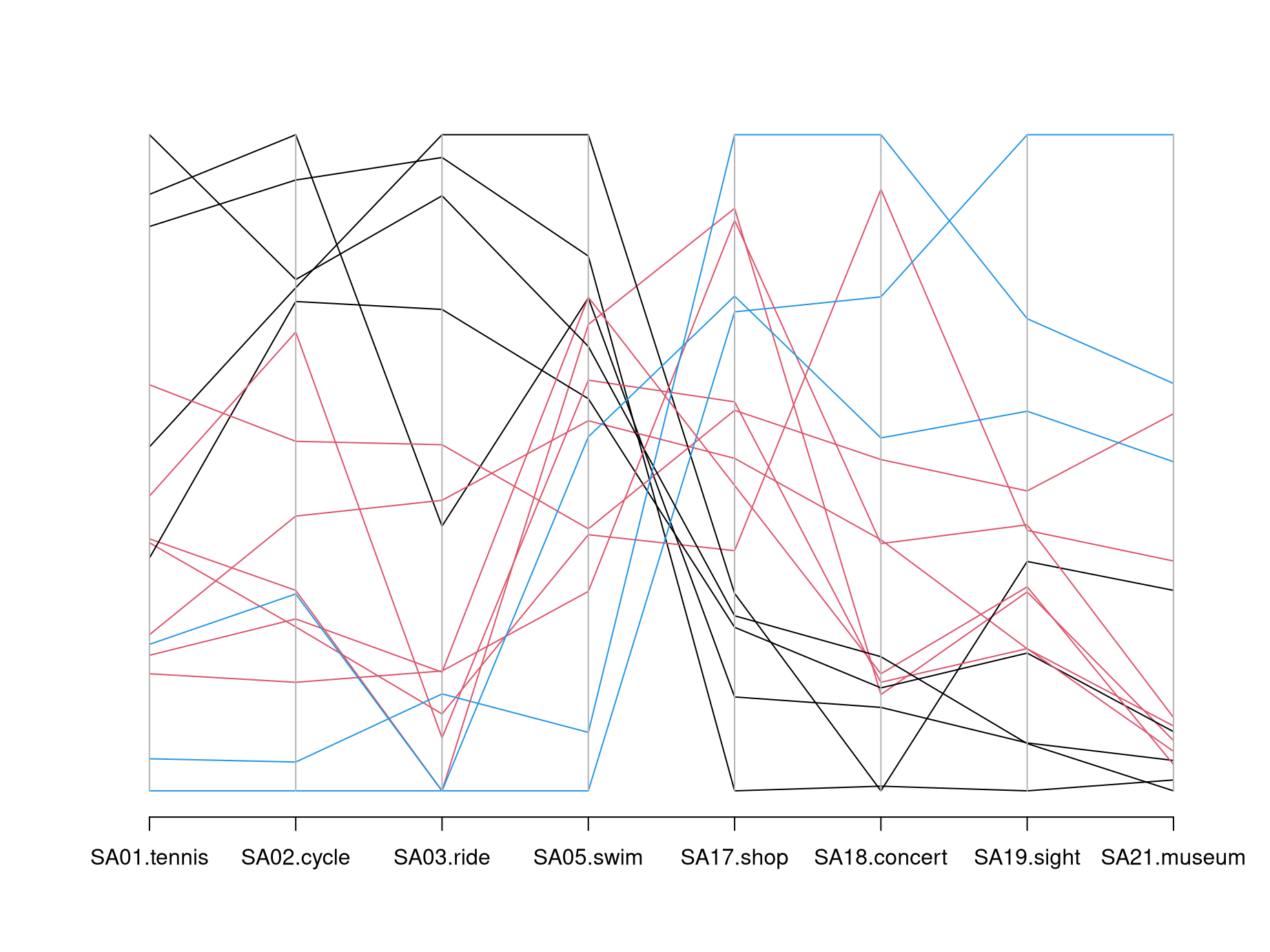
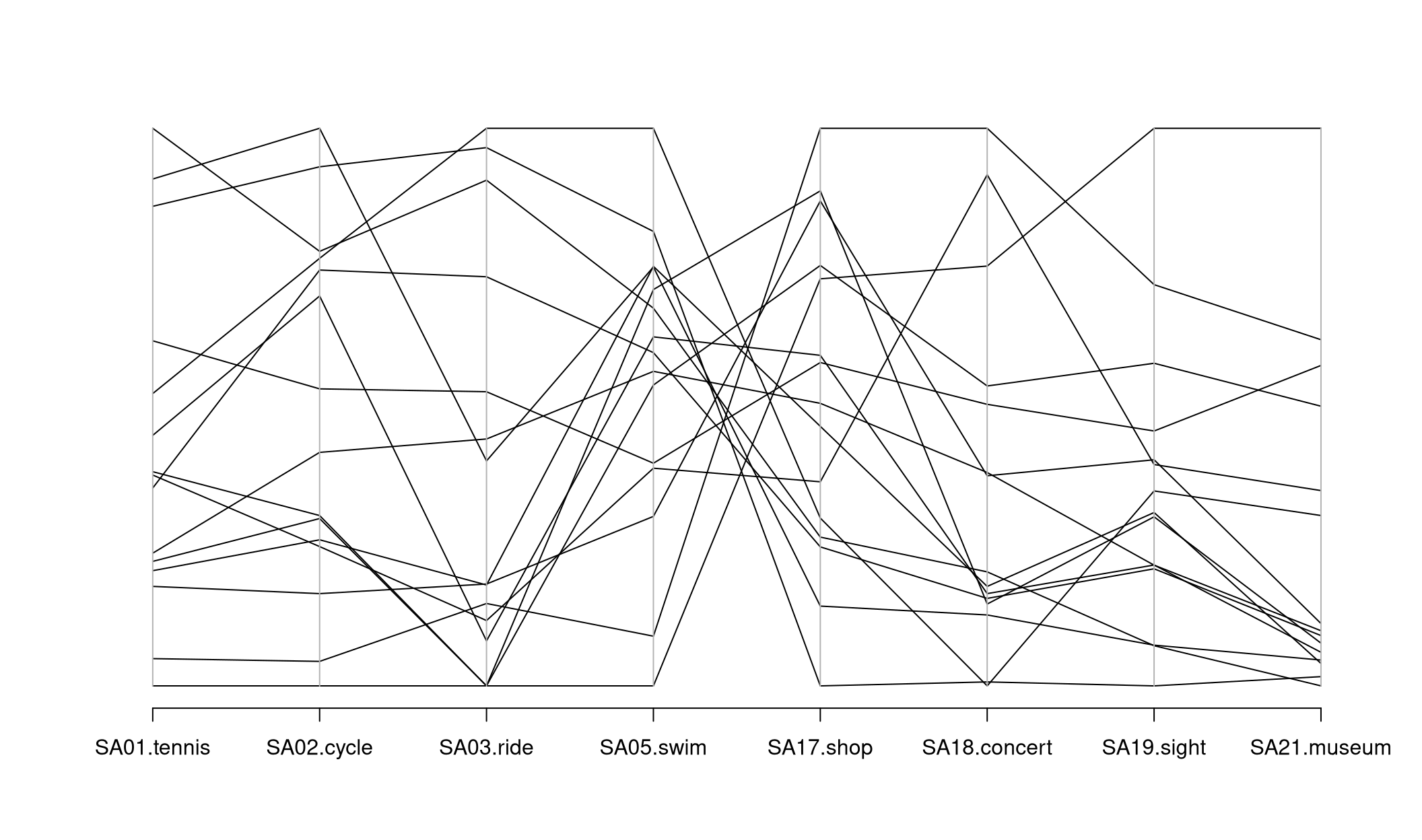
Here: Parallel coordinates are difficult to process without color coding groups of similar observations.
With more observations:
- Groups can often be found visually, also without colored groups.
- Important patterns can be emphasized, others faded out, by thick semi-transparent lines (also known as alpha blending).
Illustration: Bill length and depth, flipper length (all in~mm), and body mass (in~g) of 344 penguins from three different species (Adelie, Chinstrap, Gentoo).
R
The basic function parcoord() for visualizing parallel coordinates is
available in the standard MASS package that is readily available along with a
standard installation of R. First, we load the package with the library()
command and then create a plain parallel coordinates plot.
The X-shaped pattern in the center brings out clearly that there are many lines that switch from high values on the left (sports activities) to low values on the right (cultural activities) and vice versa.
Often parallel coordinate plots are easier to read if suitable colors are employed. Here, we could choose a medium gray (color 8 in R’s default palette) for all countries except Austria (Vienna) and Spain which are highlighted in red (color 2) or blue (color 4), respectively. The named vector with colors is set up by:
## Austria (Vienna)  Austria (other)          Belgium          Denmark           France
##                2                8                8                8                8
##          Germany          Hungary            Italy      Netherlands            Spain
##                8                8                8                8                4
##           Sweden      Switzerland               UK              USA            other
##                8                8                8                8                8
Then, it can be passed easily to parcoord(). Additionally, we increase the
line width to lwd = 2 and add minimum/maximum labels for all axes by
var.label = TRUE:
Another strategy that is often useful in parallel coordinates, in particular if
the number of observations \(n\) is large, is to use semi-transparent colors.
Then, by overplotting typical trajectories are automatically highlighted by
becoming darker. For example, to use a dark gray level (0.2) with
semi-transparent alpha blending one could set col = gray(0.2, alpha = 0.25).
The alpha = 0.25 then signals that when a certain point is overplotted 4 times
it becomes fully opaque. For very large \(n\) the alpha would have to be
decreased suitably.
Finally, the idea from parallel coordinates can in principle also be used for
the unscaled gsa data. Here, we create such a plot from scratch using the
basic matplot() function for visualizing data matrices. The lines can be
created fairly easily but some tweaks are necessary to generate nicer axis
labels.
matplot(1:8, t(gsa), col = cl,
  type = "l", lty = 1, lwd = 2,
  axes = FALSE, xlab = "", ylab = "")
abline(v = 1:8, col = "lightgray")
axis(1, at = 1:8, labels = colnames(gsa))
axis(2)
box()
Python
Parallel coordinates plots are available in pandas, but not directly in seaborn or matplotlib.
First, the code below creates a plot for the untransformed gsa data with default settings.
plt.figure(figsize=(14, 7));
pd.plotting.parallel_coordinates(gsa, class_column="Country");
plt.show()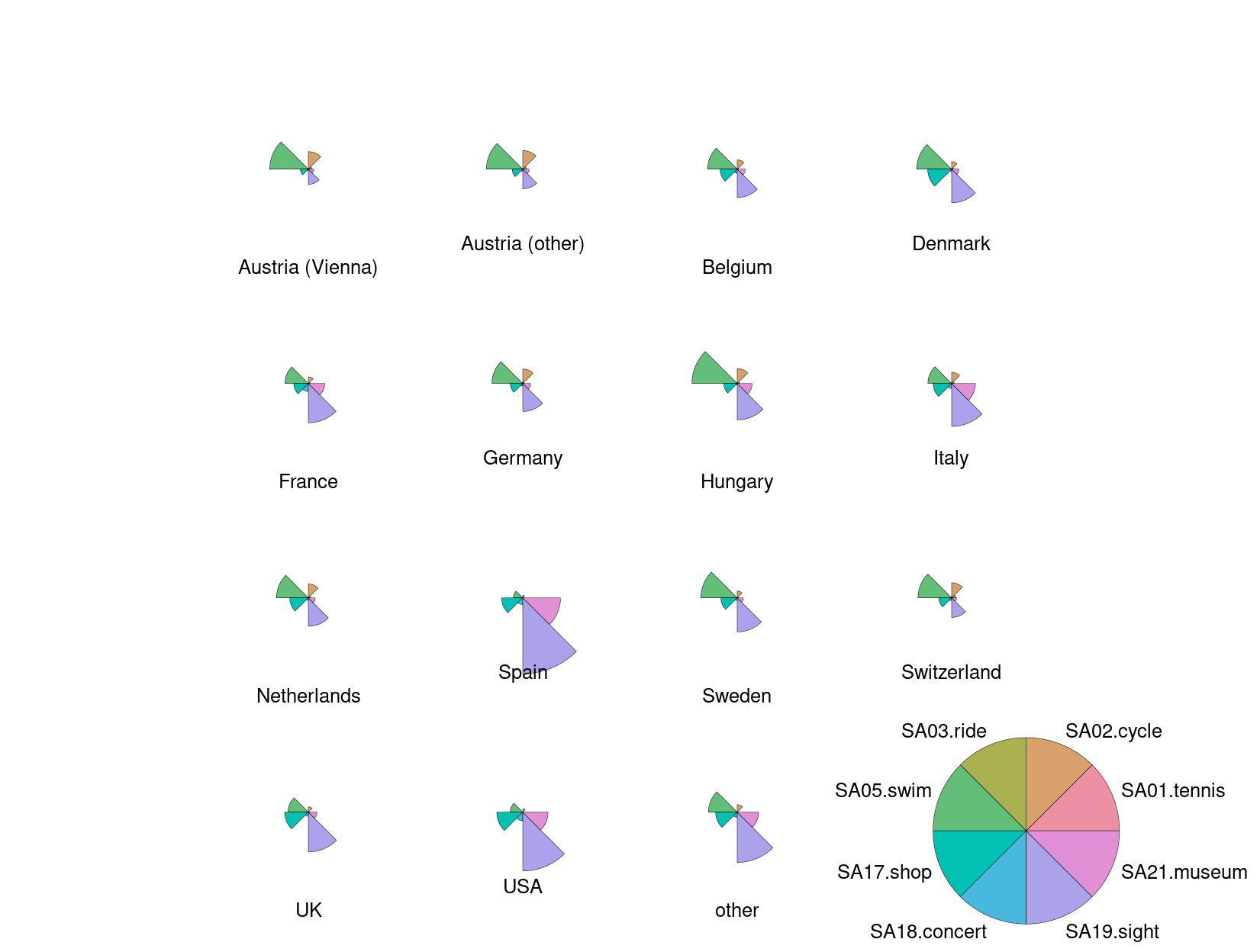
Next, we will add colors to the plot, and define a list cl. We highlight specific countries (Austria (Vienna), Spain), and leave others light gray.
cl = list()
for c in gsa.Country:
    if c=="Austria (Vienna)":
        cl.append("red")
    elif c=="Spain":
        cl.append("blue")
    else:
        cl.append("lightgray")

plt.figure(figsize=(14, 7));
pd.plotting.parallel_coordinates(gsa, class_column="Country", color=cl);
plt.show()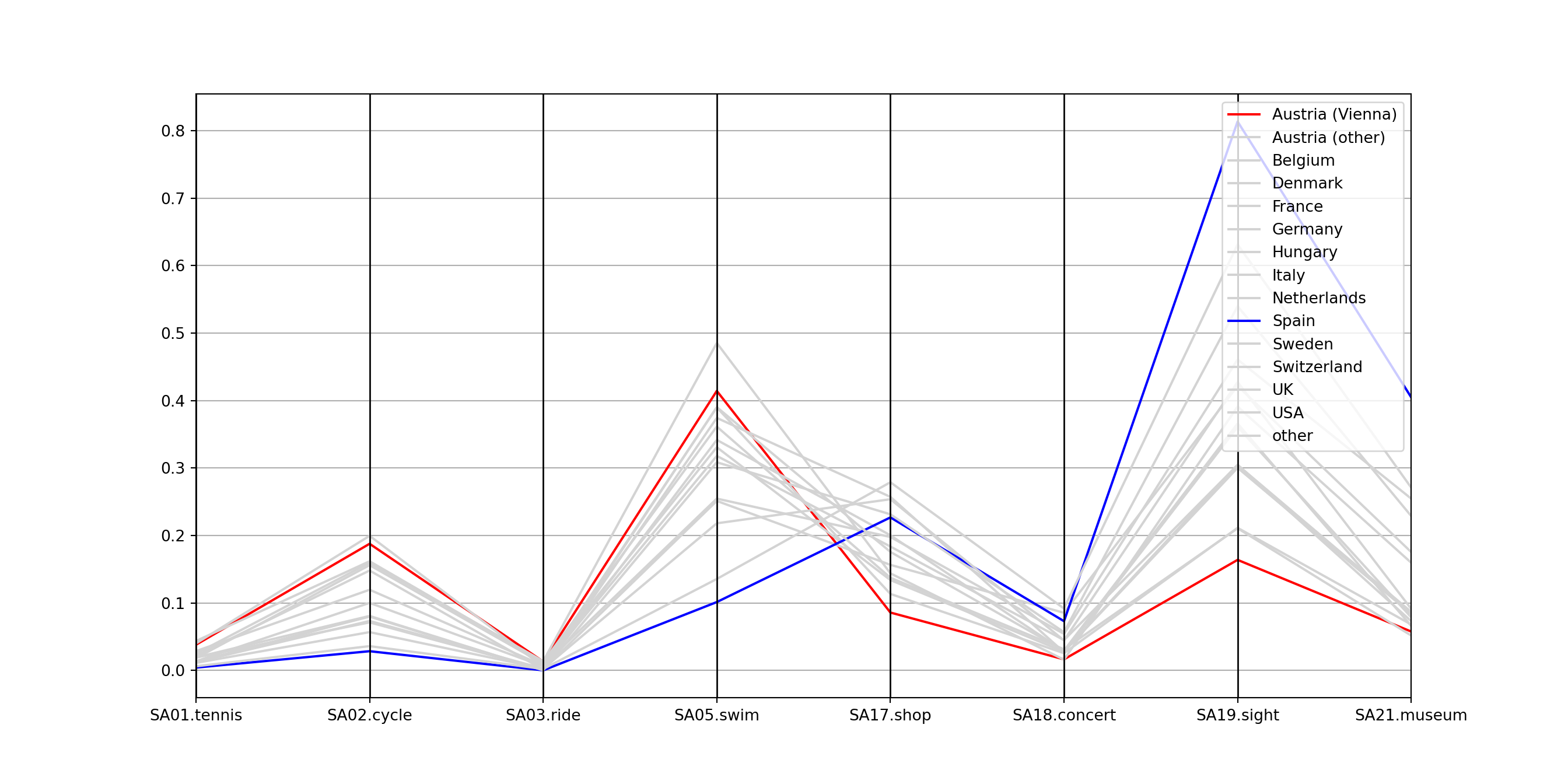
Other parameters of interest could be alpha to set a certain alpha transparency and linewidth to make the lines thicker.
Subsequently, the gsa data is standardized to a unit range in each variable, stored as gsa_norm, and visualized again.
gsa_norm = gsa.copy()
gsa_norm.iloc[:, 1:] = (gsa.iloc[:, 1:]-gsa.iloc[:, 1:].min())/(gsa.iloc[:, 1:].max()-gsa.iloc[:, 1:].min())
plt.figure(figsize=(14, 7));
pd.plotting.parallel_coordinates(gsa_norm, class_column="Country", color=cl);
plt.show()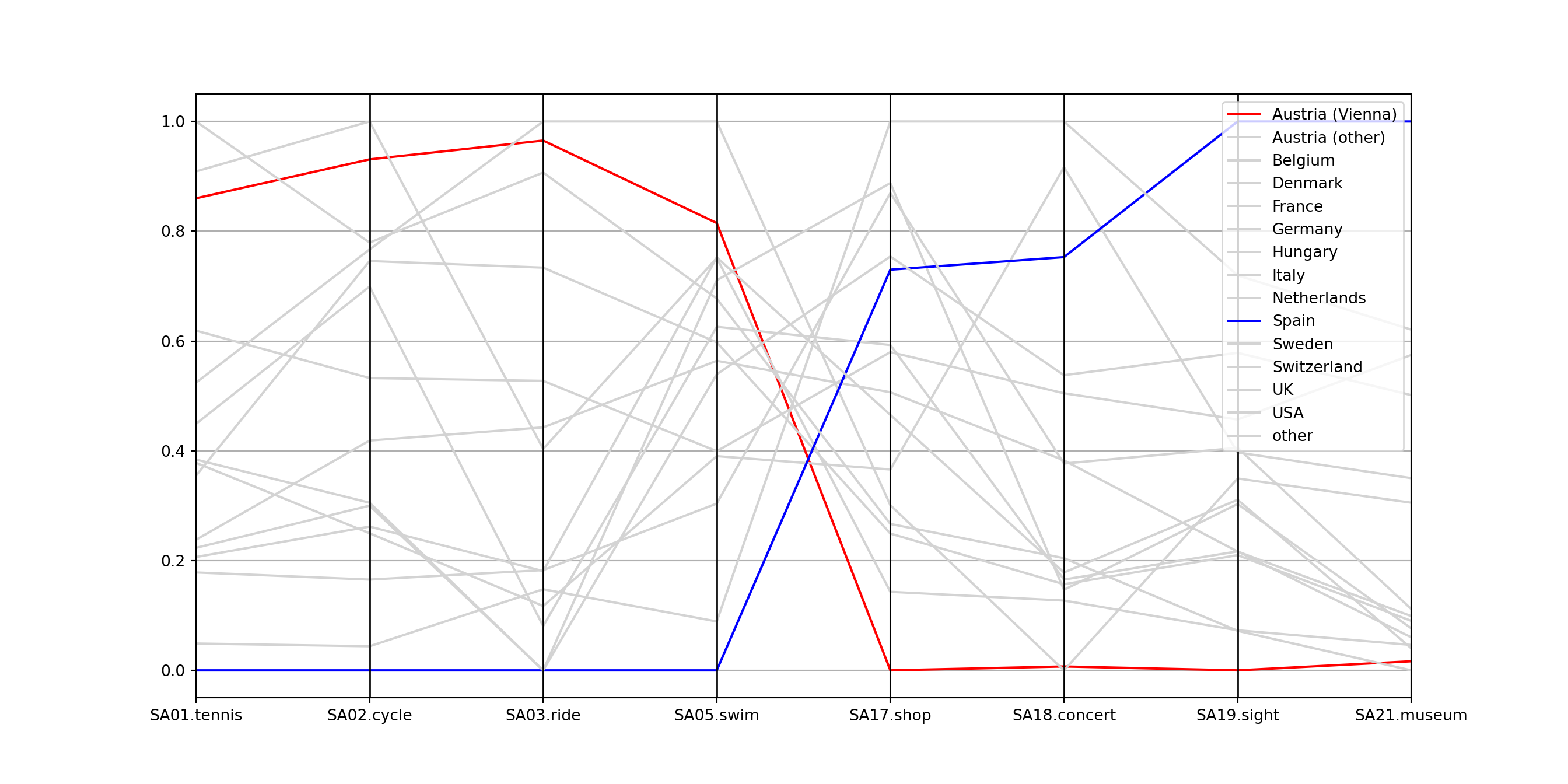
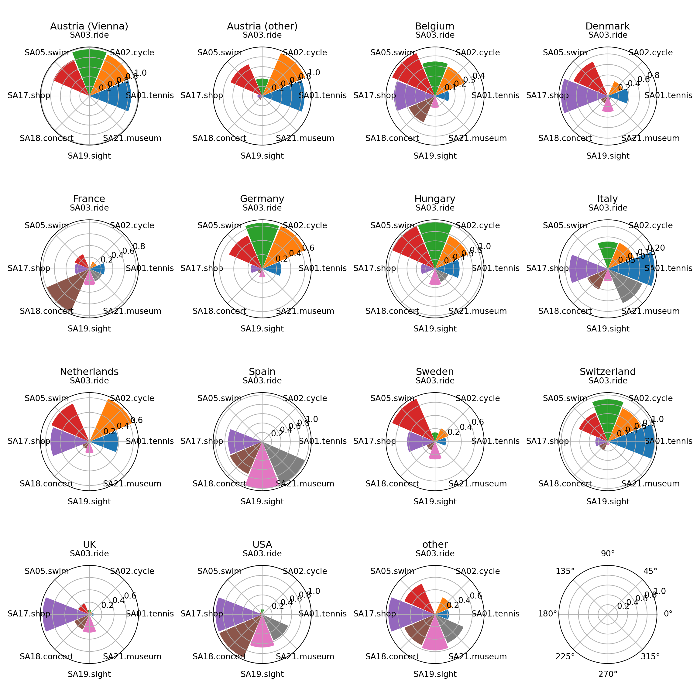
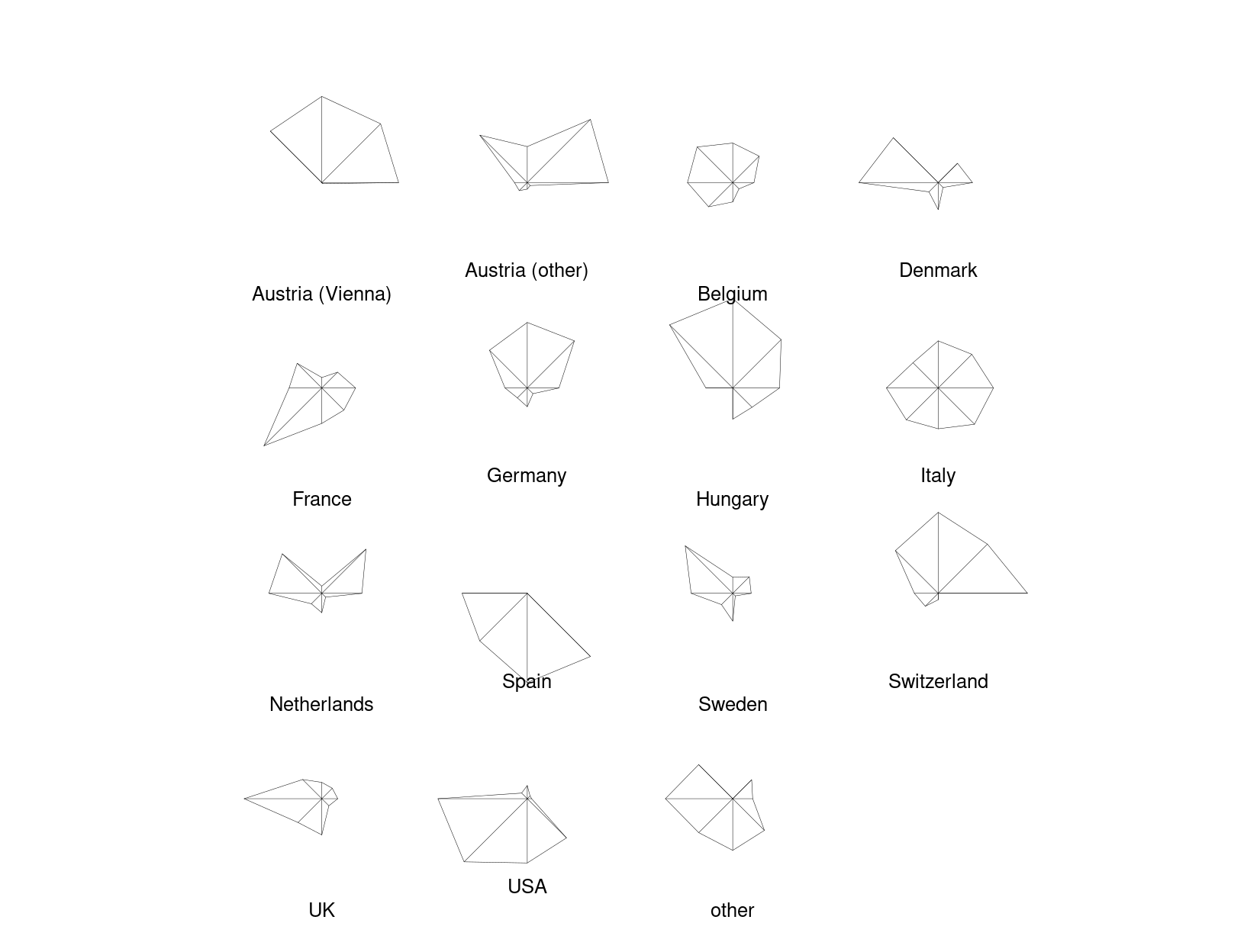
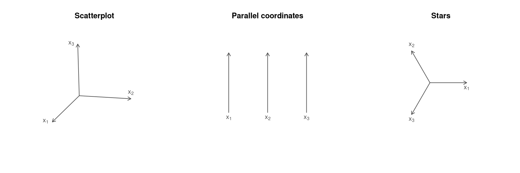
5.6 Stars
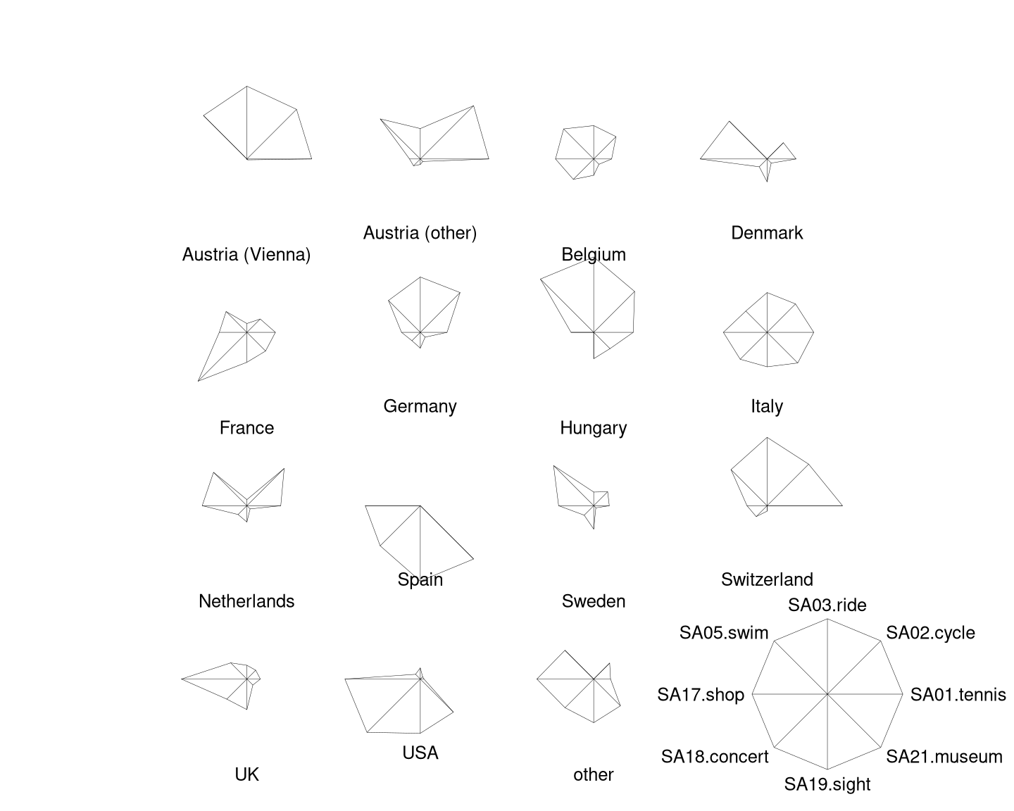
Variation: Instead of using parallel axes, it is also possible to combine the axes in a circular arrangement, resulting in a star display.
Example data: \((0.3, 0.25, 0.8)\) and \((0.6, 0.7, 0.4)\).
Additionally:
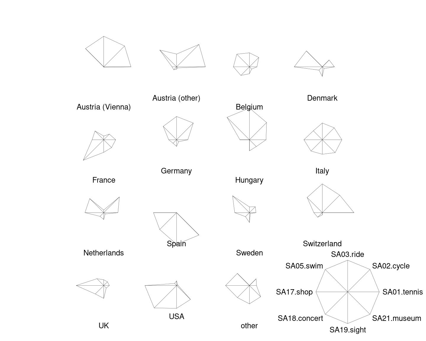
- If the number of observations \(n\) is not too large, it is possible to draw separate stars for all observation units.
- Instead of polygonal lines it is then also possible to use shaded circle segments. (Note: This is not a pie chart as the angles for all segments are equal.)
Jargon: Also known as spider plots, radar plots, suns, glyphs, etc.


R
Rather than arranging the multiple coordinate axes in parralel, they can also be
arranged around a circle like a star. And rather than adding all polygonial
lines to a single star, multiple stars are drawn by default by the stars()
function in R (but a single star with multiple lines is also possible, see
example("stars")).
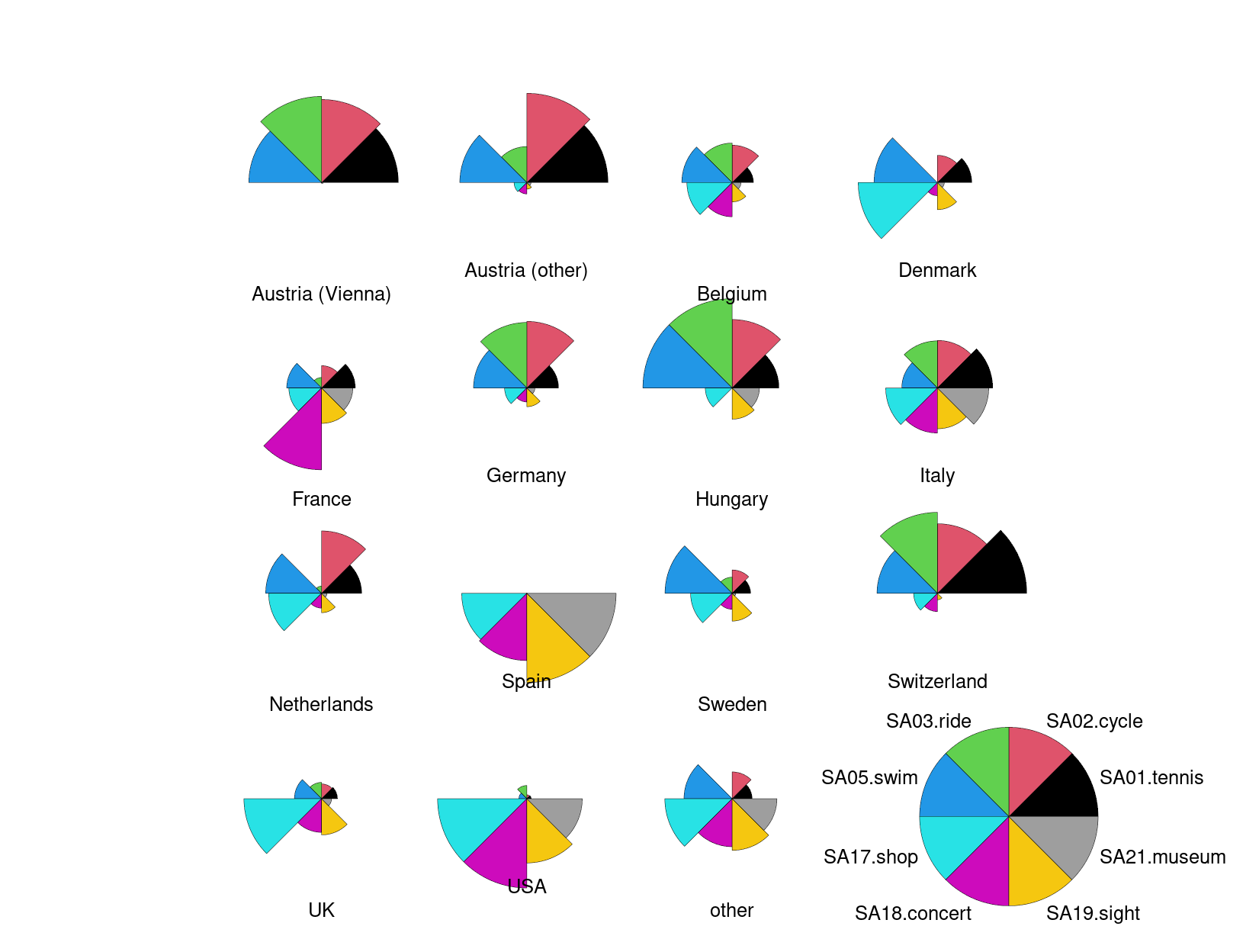
Here, we start out by drawing separate stars with polygonial lines for all 15 countries in the aggregated Guest Survey Austria data, adding a legend in the bottom right corner.
This already brings out the differences between countries like Austria and Switzerland whose interest lies mainly in sports activities (on the upper half of the stars) and countries like Spain and the USA who are mostly interested in cultural activities (on the lower half of the stars).
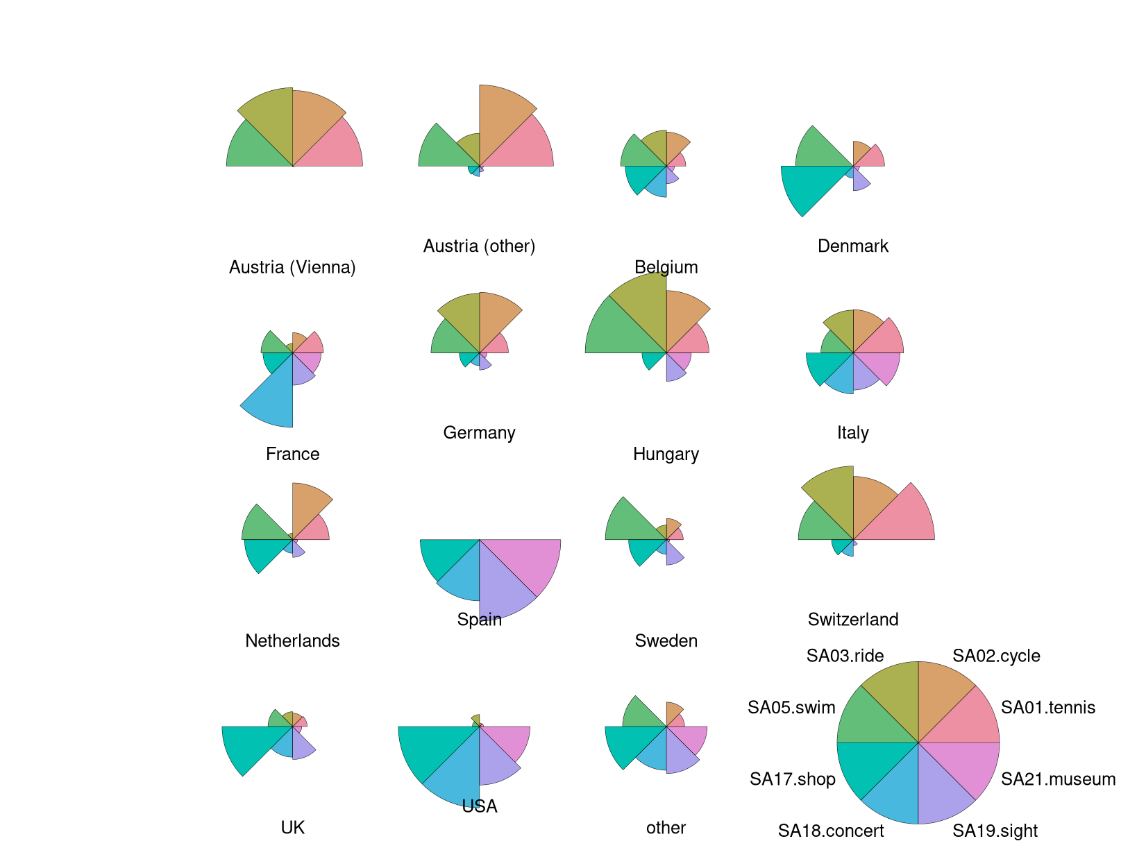
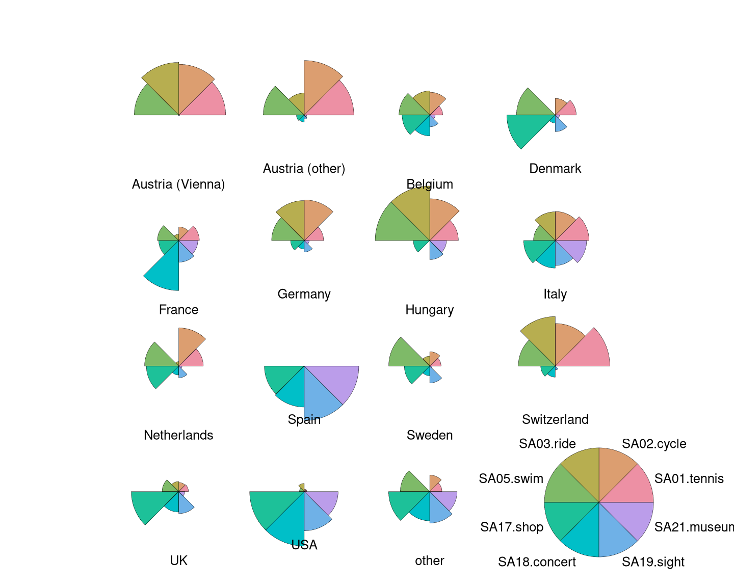
However, this difference can be brought out even more clearly when colored
segments rather than polygonial lines are used. This can be obtained by setting
draw.segments = TRUE and we additionally set the corresponding col.segments
to a balanced qualitative palette "Set 2" provided by hcl.colors().

The color shading of the segments helps to quickly distinguish countries mostly interested in sports activities (red-yellow-green) vs. cultural activities (green-blue-purple).
Note that these are not pie charts because all segments have the same angle but different radius. In contrast a pie chart would have the same radius but vary the angle.
Potential further variations of the stars() could be obtained by setting
scale = FALSE or by visualizing t(gsa) instead of gsa. The former switches
off scaling to the unit interval \([0, 1]\) and uses the raw scale instead. The
latter switches the roles of units and variables. For the gsa data both
variations only bring out that there are popular summer activities (like
swimming or sightseeing) and other that are rarely done (like tennis or riding).
Hence these two displays are not shown explicitly here.
Python
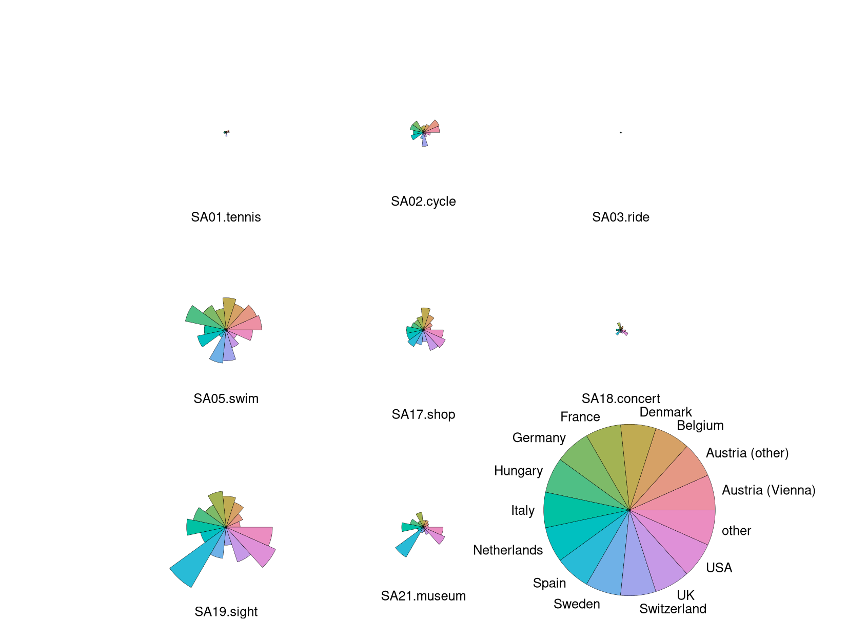
There is no default stars() (or radar(), spider()) chart function in python().
However, matplotlib can implement them through bar charts on polar axis, via the specificator projection='polar'
This necessitates three key inputs:
The
thetaparameter is a list of angles (we use the variablemy_theta). If controls the distribution of bars “around the clock”. It uses radians as unit, and 0 is facing east. 360 degrees is therefore 2*pi. For creating a list of n equally spaced angles, we can usenp.linspace(starting_angle, stopping_angle, num_of_bars)The
radiiparameter controls the “height” of the bars, again we need a list of values. For keeping with the tutorial conventions, we plot the standardized values fromgsa_norm. As they originally have positive and negative values (which works for R plotting), we will additionally adjust them for this matplotlib plot to being non-negative values, by simple saying non_neg_radius = current_radius - minimum_radius, with minimum_radius being a negative value.The
widthparameter controls how wide the bar is. Again, we enter a list of values for our bars. For simplicity, we will setwidthto 0.75 for all bars, which is clearly visible but won’t cause overlap.
# theta
my_labels = list(gsa_norm.columns)[1:]
my_theta = np.linspace(0, 2*np.pi, len(my_labels), endpoint=False)
# radii
prep_radii = gsa_norm.iloc[0,1:].values
my_radii = prep_radii - min(prep_radii)
# width
my_width = np.repeat(0.75, len(my_labels))

# color palette and annotation
my_colors = list(mcolors.TABLEAU_COLORS.values())[0:len(my_labels)]
my_title = "Austria (Vienna)"

# plot
ax = plt.subplot(projection='polar');
ax.bar(my_theta, my_radii, width=my_width, bottom=0.0, color=my_colors, tick_label = my_labels);
ax.set_title(my_title, size='large', position=(0.5, 1.1),
             horizontalalignment='center', verticalalignment='center');
plt.show()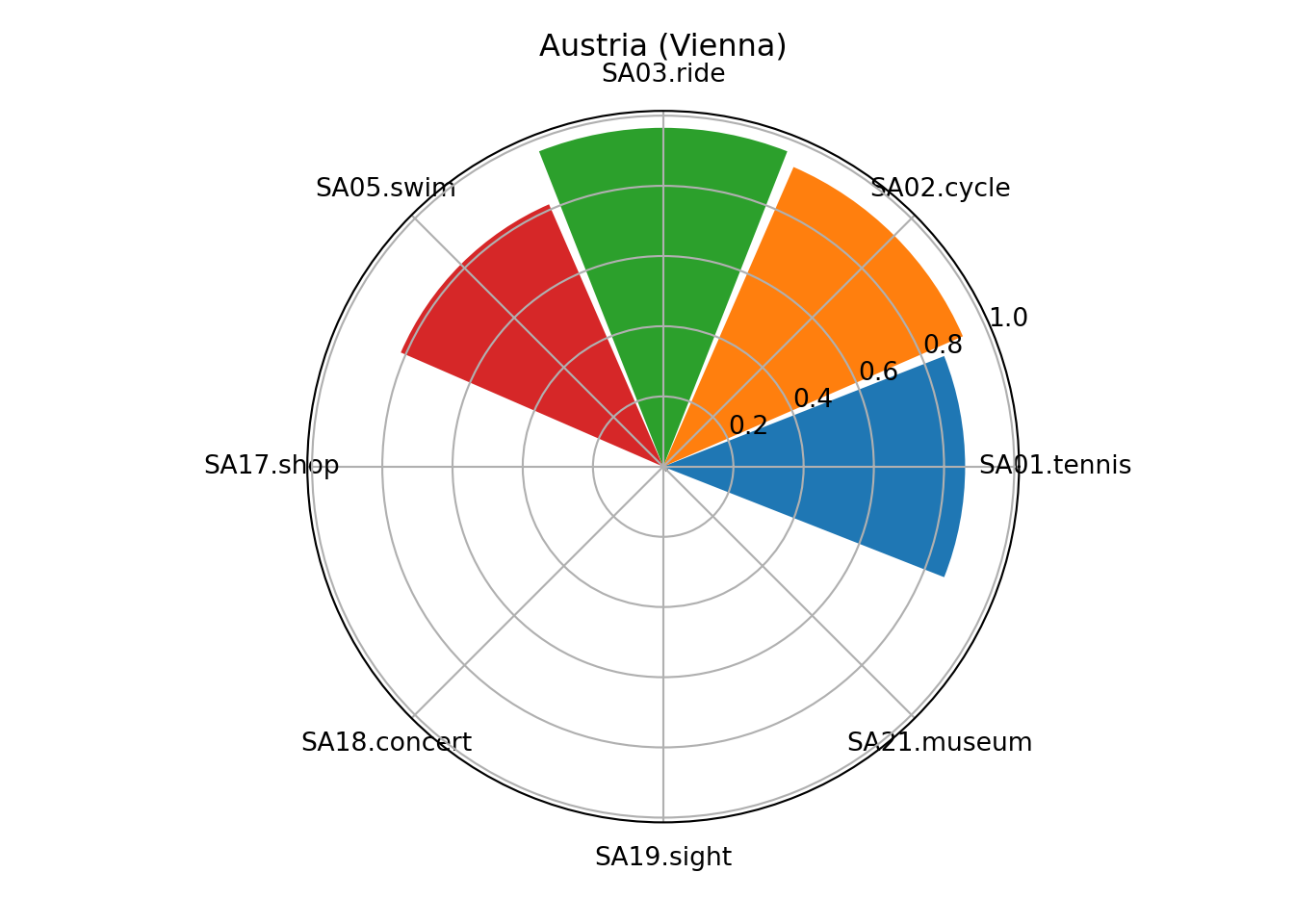
Next separate plots for the different countries can be generated in one figure using the subplots command fig, axs = plt.subplots().
For looping through the countries flat_axs = axs.flatten() provides access to subplots via an one-dimensional index which makes looping much easier.
fig, axs = plt.subplots(figsize=(12, 12), nrows=4, ncols=4, subplot_kw=dict(projection='polar'));
fig.subplots_adjust(wspace=0.4, hspace=0.5, top=0.85, bottom=0.05);
flat_axs = axs.flatten();

for i in range(len(gsa_norm)):
    prep_radii = gsa_norm.loc[i,my_labels].values
    my_radii = prep_radii - min(prep_radii)

    flat_axs[i].bar(my_theta, my_radii, width=my_width, color=my_colors, tick_label = my_labels);
    flat_axs[i].set_title(gsa_norm["Country"][i], size='large', position=(0.5, 1.1),
                 horizontalalignment='center', verticalalignment='center');
plt.tight_layout();
plt.show()