Chapter 4 Basic exploratory data analysis
4.1 Univariate exploratory analysis
One quantitative variable:
Example: amount in BBBClub data.
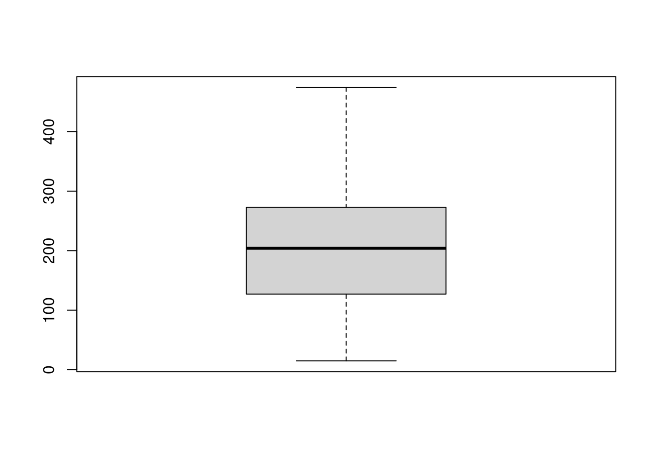
Numeric description: Mean, variance, standard deviation, five-point summary (minimum, lower quartile, median, upper quartile, maximum).
## Min. 1st Qu. Median Mean 3rd Qu. Max.
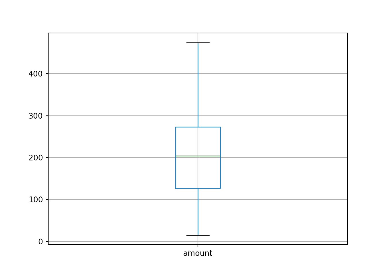
## 15 127 204 201 273 474Graphic description: Histogram, box plot.

One qualitative variable
Example: gender in BBBClub data.
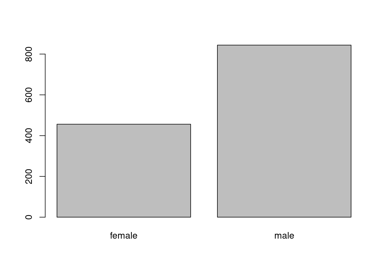
Numeric description: Frequency table (absolute and relative).
##
## female   male
##    456    844
##
## female male
## 0.351 0.649Graphic description: Bar plot.

4.2 Bivariate exploratory analysis
Bivariate exploratory methods depend on the combination of measurement scales of the two variables involved. Moreover, it may be important which variable plays the role of the dependent variable and which is the explanatory variable.
In case there is not natural assignment to dependent/explanatory variable, it is tyically feasible to try both variants.
| Dep. vs. expl. | Quantitative | Qualitative |
|---|---|---|
| Quantitative | Scatter plot Correlation |
Box plot Groupwise statistics |
| Qualitative | Discret. mosaic plot Discret. contingency table |
Mosaic plot Contingency table |
Two quantitative variables
Example: amount and last.
Numeric description: Correlation coefficient.
Correlation: \(r = 0.452\)
Graphic description: Scatter plot.
One dependent quantitative and one explanatory qualitative variable
Example: amount and gender.
Numeric description: Groupwise statistics.
Means: Men \(203.5\), women \(200.2\).
Five-point summary:
| Min. | \(Q_1\) | Median | \(Q_3\) | Max. | |
|---|---|---|---|---|---|
| Men | 17 | 132 | 199.5 | 273.5 | 473 |
| Women | 15 | 125 | 205.5 | 272.0 | 474 |
Graphic description: Parallel box plots.
Two qualitative variables
Example: choice and gender.
Numeric description: Contingency table, odds ratio.
Absolute frequencies with marginal distribution:
| Gender vs. choice | No | Yes | Sum |
|---|---|---|---|
| Men | 273 | 183 | 456 |
| Women | 627 | 217 | 844 |
| Sum | 900 | 400 | 1,300 |
Relative frequencies with marginal distribution:
| Gender vs. choice | No | Yes | Sum |
|---|---|---|---|
| Men | 0.210 | 0.141 | 0.351 |
| Women | 0.482 | 0.167 | 0.649 |
| Sum | 0.692 | 0.308 | 1 |
Conditional relative frequencies:
| Gender vs. choice | No | Yes | Sum |
|---|---|---|---|
| Men | 0.599 | 0.401 | 1 |
| Women | 0.743 | 0.257 | 1 |
Graphic description: Mosaic plot.
The mosaic plot is an area-proportional display of a contingency table, i.e., the larger the area of a mosaic tile the larger the corresponding frequency.
Construction: A rectangle is partitioned recursively pertaining to the relative frequencies of the corresponding margin, conditional on all preceding margins.
Here: First split with respect to the relative frequencies of gender. Subsequently split with respect to the conditional relative frequencies of choice given gender.


One dependent qualitative and one explanatory quantitative variable
Example: choice and amount.
Numeric description: Discretized contingency table.
Graphic description: Discretized mosaic plot.
Idea: Transform the explanatory quantitative variable to a qualitative variable by splitting it into intervals. This is the same idea as used in the histogram.
How to choose the breaks for the intervals? For example based on the five-point summary.
Five-point summary of amount:
| Min. | \(Q_1\) | Median | \(Q_3\) | Max. | |
|---|---|---|---|---|---|
| Amount | 15 | 127 | 204 | 273 | 474 |
Discretized contingency table:
| C. vs. A. | [15, 127] | (127, 204] | (204, 273] | (273, 474] | Sum |
|---|---|---|---|---|---|
| No | 247 | 240 | 219 | 194 | 900 |
| Yes | 79 | 87 | 111 | 123 | 400 |
| Sum | 326 | 327 | 330 | 317 | 1,300 |


4.3 Tutorial
4.3.1 Setup
For illustrating the basics of exploratory data analysis (EDA) we consider the data from the Bookbinders Book Club case study. Download the BBBClub data set as BBBClub.csv or BBBClub.rda.
The readily prepared data frame can be loaded providing 1,300 observations (rows) of 11 variables (columns).
Python
For the Python setup, make sure that the required libraries are installed.
The dimensions and column names of the data frame are given by:
R
## [1] "data.frame"## [1] 1300 11## [1] "choice" "gender" "amount" "freq" "last" "first" "child" "youth" "cook"
## [10] "diy" "art"The variables in the data frame are:
| Variable | Description |
|---|---|
choice |
Did the customer buy the book “The Art History of Florence”? |
gender |
Gender. |
amount |
Total amount spent at BBB Club. |
freq |
Total frequency of purchases at BBB Club. |
last |
Months since last purchase. |
first |
Months since first purchase. |
child |
Number of children’s books purchased. |
youth |
Number of youth books purchased. |
cook |
Number of cooking books purchased. |
diy |
Number of do-it-yourself books purchased. |
art |
Number of art books purchased. |
The first few lines of the data frame are given by:
Subsequently, we carry out a basic EDA for several of the variables using amount as a typical quantitative and gender as a typical qualitative variable:
4.3.2 One quantitative variable
For describing a quantitative variable the usual basic summary statistics can be employed: mean, variance, standard deviation, minimum and maximum, and five-point summary (minimum, lower quartile, median, upper quartile, maximum).
R
Corresponding functions are easily available in base R.
Writing mean(BBBClub$amount) with the $ extractor is somewhat
tedious in interactive use, we first attach() the BBBClub data frame so that
we can write mean(amount) instead. We want to emphasize, though, that
attach() should be used with care:
- Only attach at most one data frame at a time.
- Do so only for accessing variables in the data frame and not for transforming them.
- Employ functions with formula interfaces where available (that do not require
extraction with
$). - Detach the data frame again when the exploratory analysis has been completed.
With the data attached we now compute the following basic statistics:
## [1] 201.369## [1] 8954.53## [1] 94.6284## [1] 15## [1] 474## [1] 15 127 204 273 474## Min. 1st Qu. Median Mean 3rd Qu. Max.
## 15 127 204 201 273 474The final summary() is a collection of all other statistics above except for
variance and standard deviation. The customers have spent an amount between
15 and 474 dollars with a median and
average of 204 and 201.369231, respectively. The
central 50% of customers have spent between 127 and
273 dollars.
Note: Many of the functions above return NA (for “not available”) in case
any of the individual observations in a vector is NA. In order to ignore these
missing values (by removing them first) for computing the statistics, one can
then typically set the argument na.rm = TRUE.
Python
Corresponding functions are easily available in pandas.
## 201.36923076923077## 8954.525611417066## 94.62835521880884## 15## 474## count 1300.0000
## mean 201.3692
## std 94.6284
## min 15.0000
## 25% 127.0000
## 50% 204.0000
## 75% 273.0000
## max 474.0000
## Name: amount, dtype: float64We provide the fivenum() function to compute the five-point summary (minimum, lower quartile, median, upper quartile, maximum).
def fivenum(data):
    """
    A function that computes the five-number summary.

    :param data: A column of 'pandas.DataFrame'
    :param column: The column of the DataFrame to use (string)

    :returns: The five numbers (list)
    """
    five_num = list()
    five_num.append(data.min()) # Min
    five_num.append(data.quantile(q=0.25)) # 1st Quantile
    five_num.append(data.quantile(q=0.5)) # Median
    five_num.append(data.quantile(q=0.75)) # 3st Quantile
    five_num.append(data.max()) # Max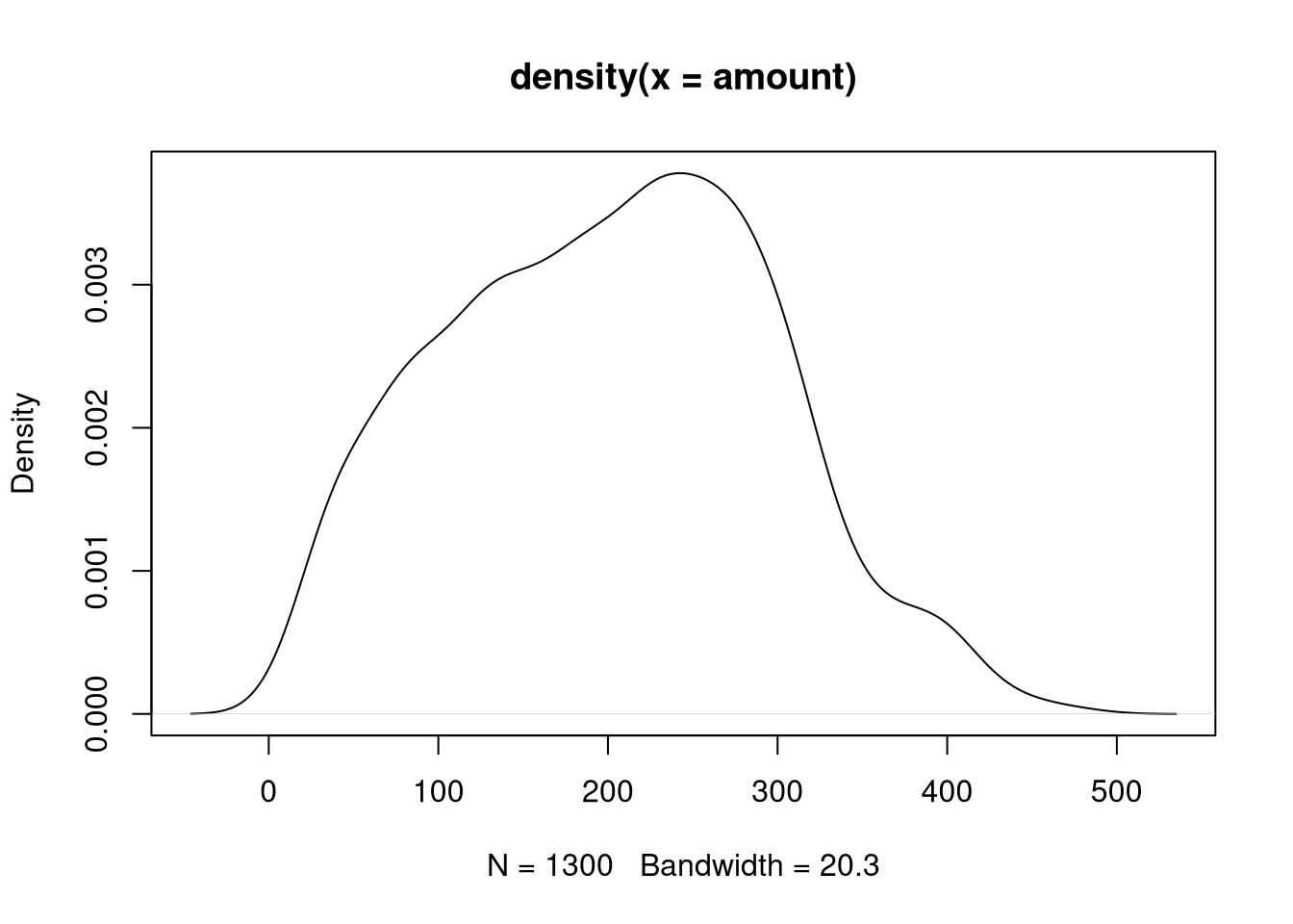
return five_num## [np.int64(15), np.float64(127.0), np.float64(204.0), np.float64(273.0), np.int64(474)]Somewhat easier to grasp compared to the numerical summaries are graphical visualizations like the histogram (based on binning the data) or the kernel density (based on smoothing).
R
These can be generated with hist() (that
directly plots the histogram by default) and density() (that needs an
explicitly plot() call), respectively.
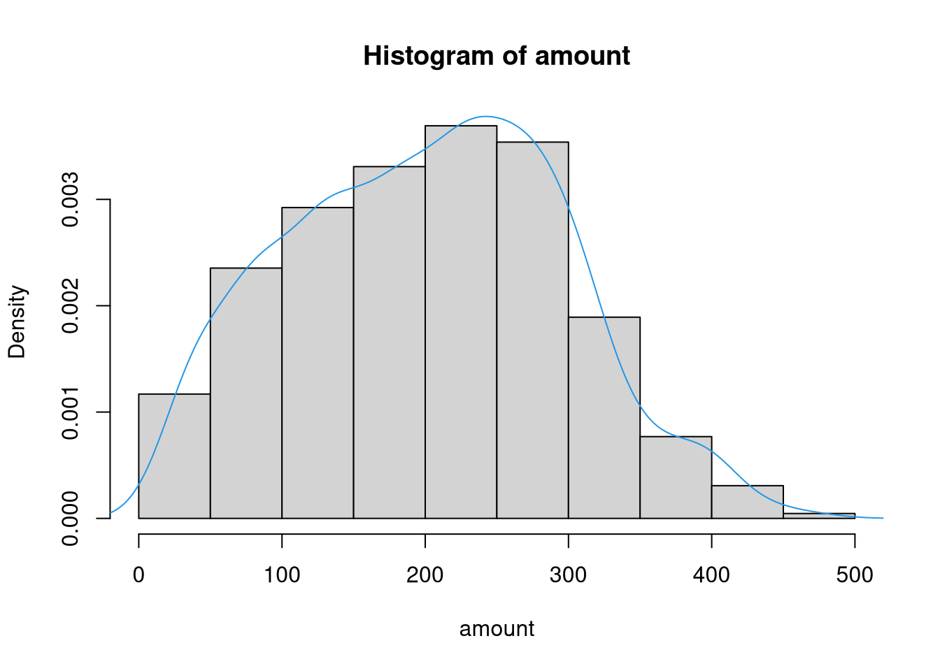
If a density histogram (with overall area 1) is used instead of the default frequency histogram (at least when bins are equidistant), both displays can also easily be combined:
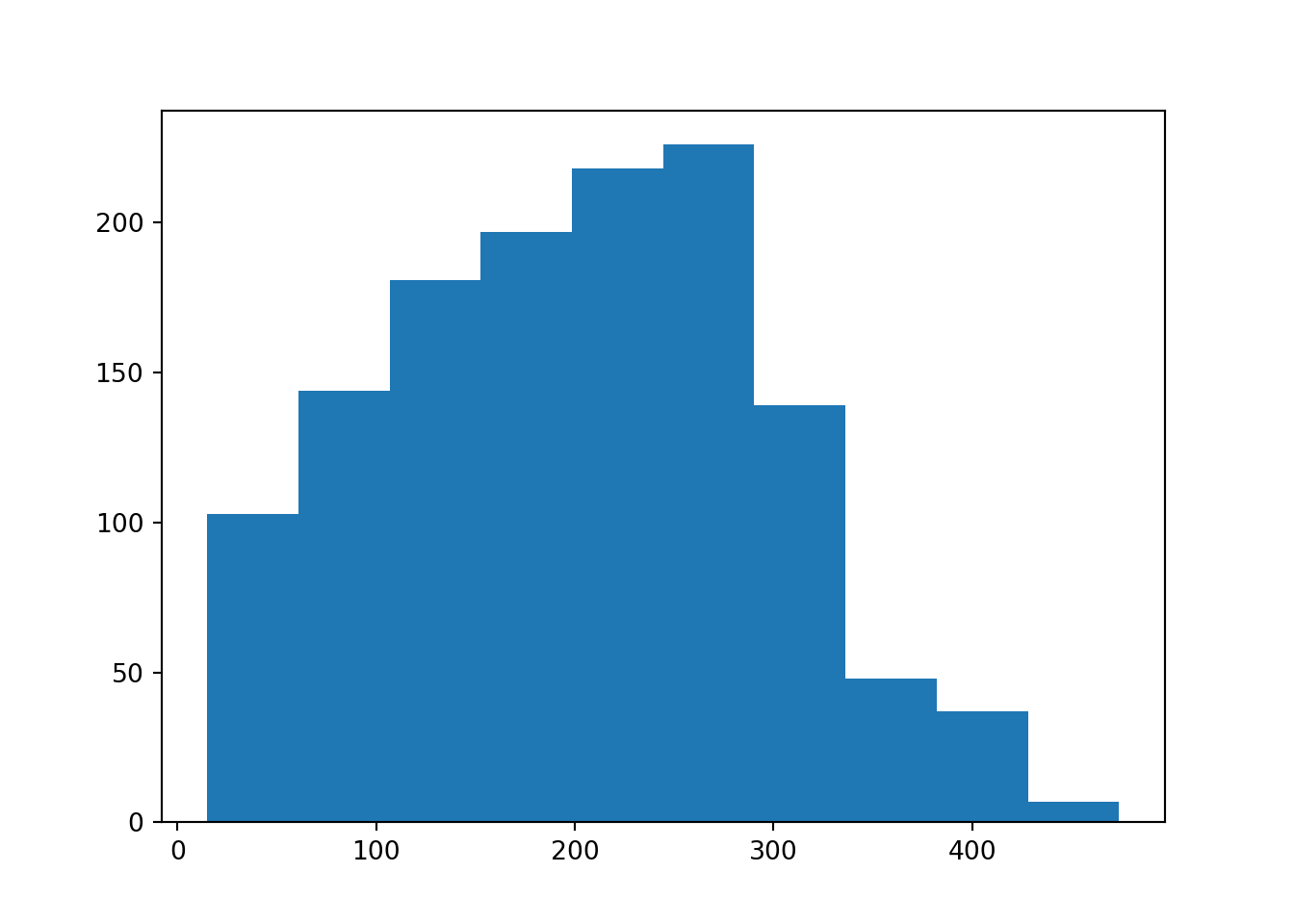
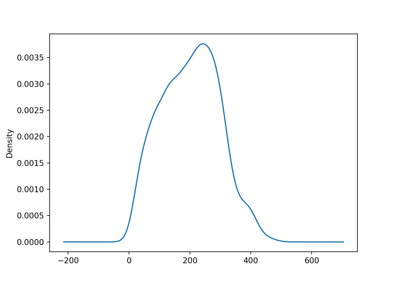
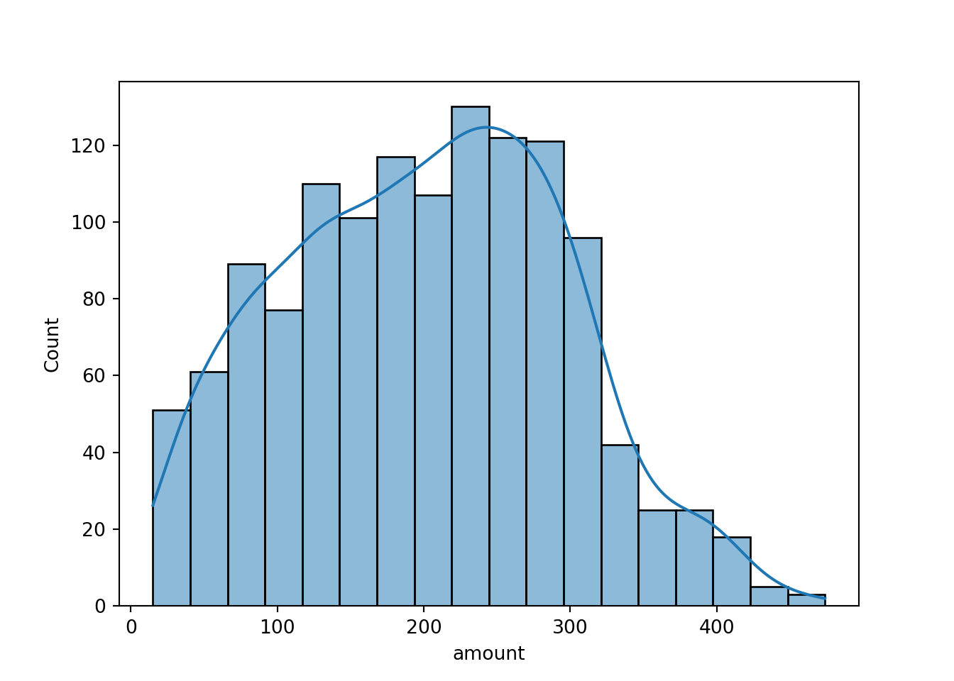
Both displays show that the amount variable is unimodal and slightly
right-skewed.
Another graphical display that compresses the data even further is the box plot. While this is probably more appealing for visualizing multiple groups in parallel (see below), it is also possible to generate a box plot for a single variable, essentially showing the five-point summary above:
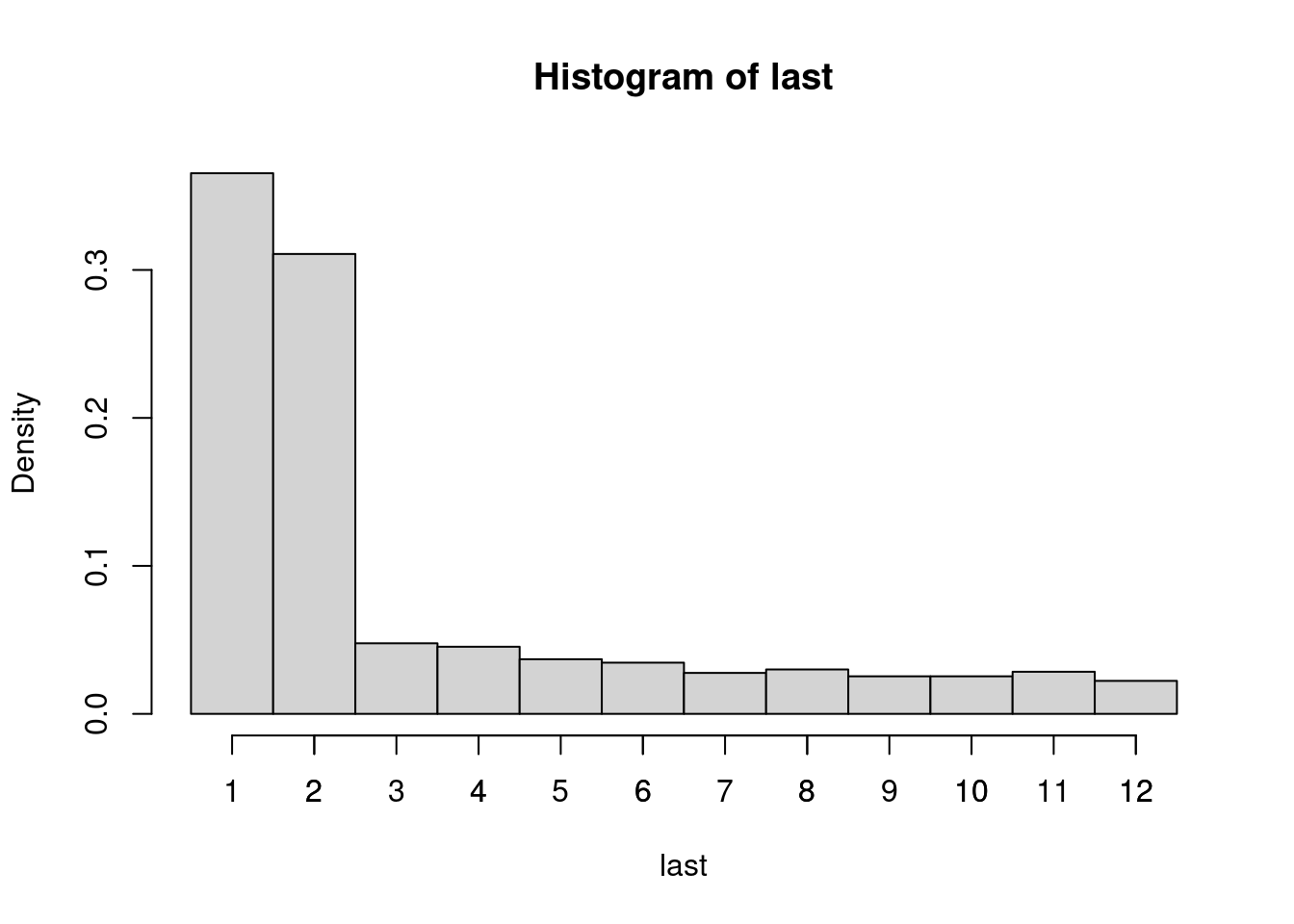
In case the quantitative variable is measured discretely with relatively few
distinct values, it might make sense to also consider frequency tables in
addition to the summary statistics above. To illustrate this we employ the
variable last that codes the number of months since the last purchase in the
book club. At most this can be 12 because every customer is required to make at
least one purchase per year.
R
The absolute frequencies can be easily obtained
with table(), showing that most customers have purchased something one or two
months ago.
## last
##   1   2   3   4   5   6   7   8   9  10  11  12
## 475 404  62  59  48  45  36  39  33  33  37  29
The corresponding histogram can be plotted setting breaks in between the count values at \(0.5, 1.5, \dots, 12.5\). Subsequently, we also add a separate axis tick mark for each count \(1, 2, \dots, 12\).

Python
The absolute frequencies can be easily obtained with value_counts(), showing that most customers have purchased something one or two months ago.
## last
## 1     475
## 2     404
## 3      62
## 4      59
## 5      48
## 6      45
## 8      39
## 11     37
## 7      36
## 9      33
## 10     33
## 12     29
## Name: count, dtype: int64
The corresponding histogram can be plotted by
4.3.3 One qualitative variable
For numerically summarizing a qualitative variable, we can compute the frequency table with:
R
If a qualitative variable is already coded appropriately as a factor in R,
such as the gender variable in the BBBClub data, then many generic such as
summary(gender) and plot(gender) automatically choose an appropriate
methods. Below we show how these methods can be customized or supplemented with
other tools.
We can simply compute the frequency table with either one of:
## female   male
## 456 844## gender
## female male
## 456 844The corresponding relative frequencies can be computed for a proportions table.
The corresponding bar plot can be plotted by:

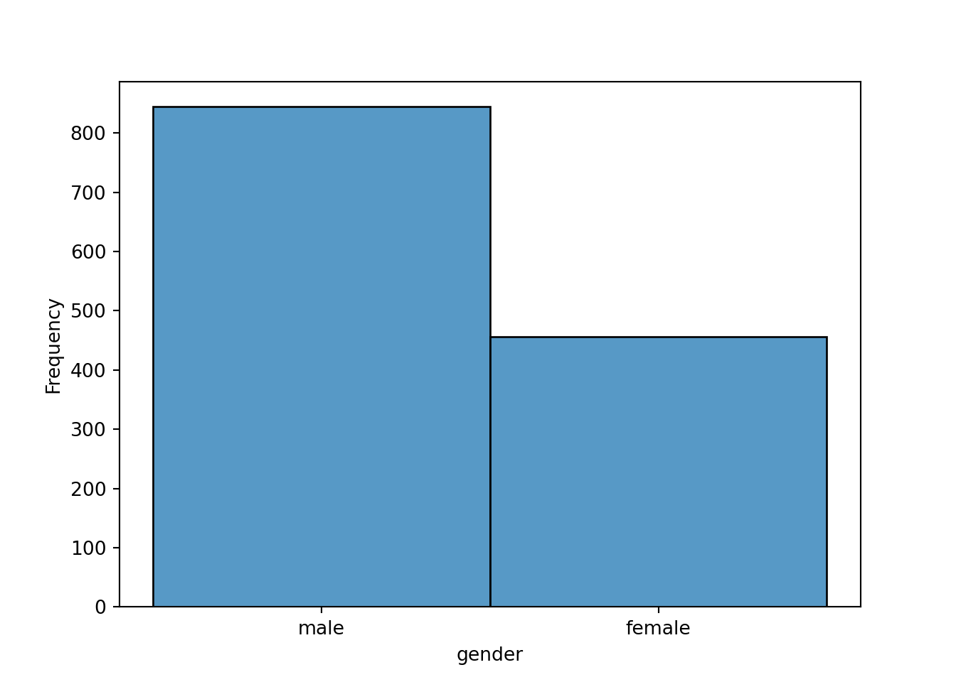
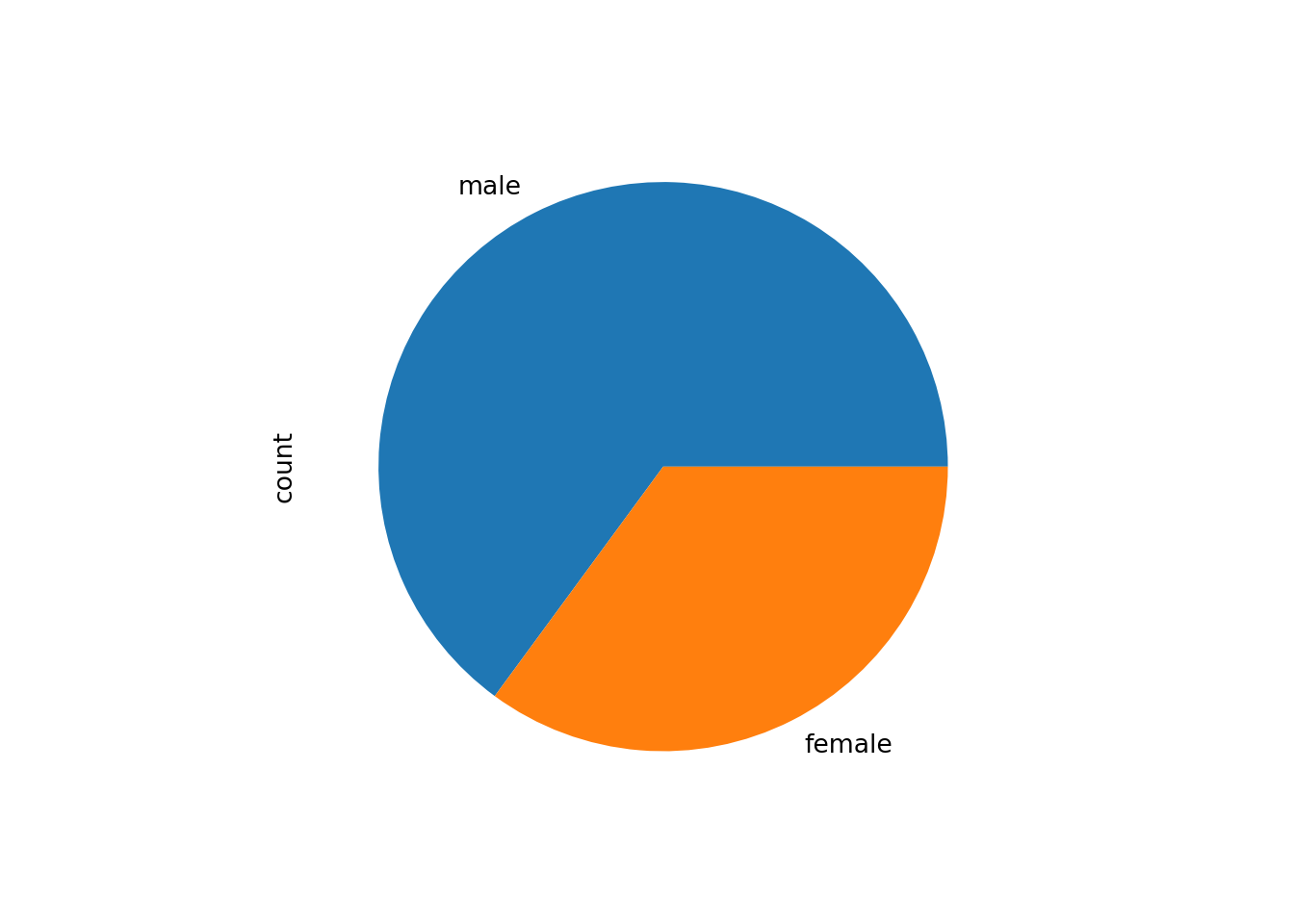
All of these show that about two thirds of the customers are male and one third female.
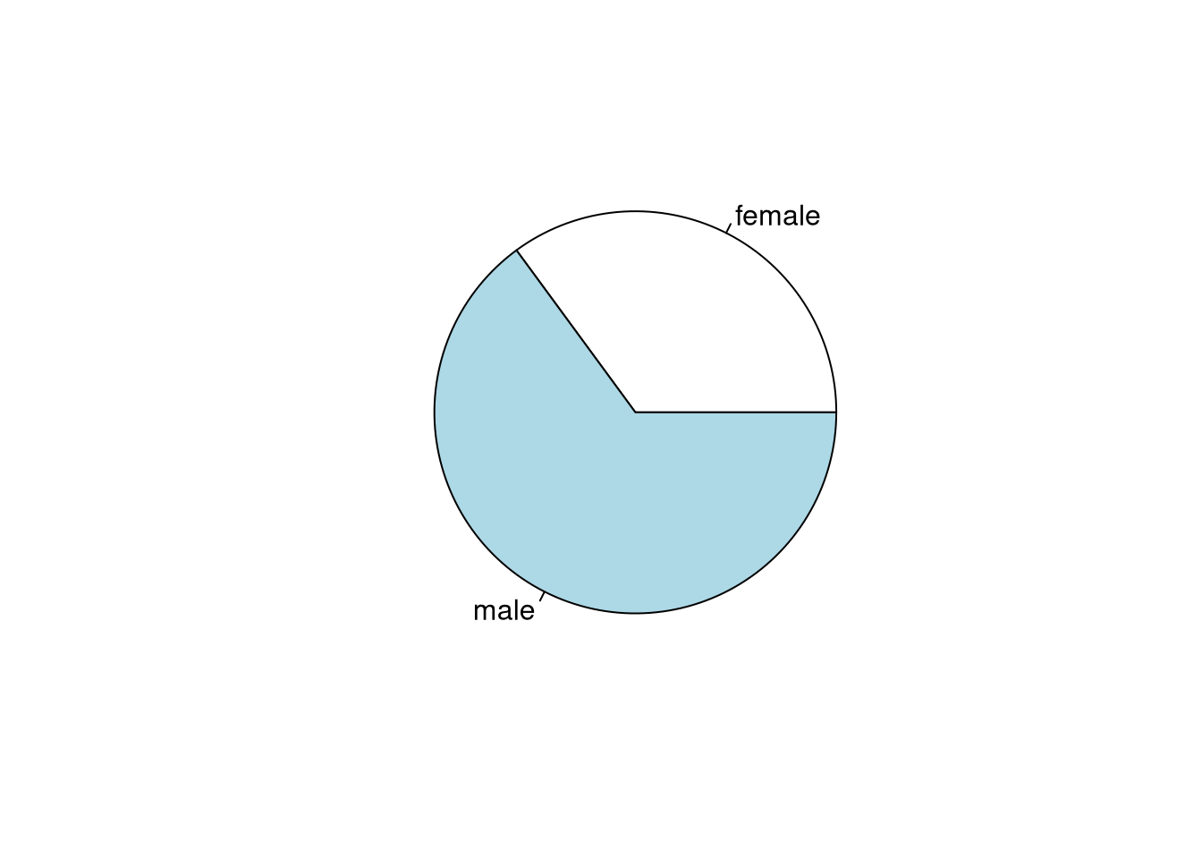
An alternative visual display is the pie chart. However, this is more suitable for conveying whether combinations of segments form a majority. For most other purposes a bar plot is preferable.
4.3.4 Two quantitative variables
The classical summary statistic for capturing the association between two quantitative variables is the Pearson correlation coefficient.
R
In R this is available in the cor() function as the default method = "pearson" along with
alternative methods Spearman’s \(\varrho\) ("spearman") and Kendall’s \(\tau\)
("kendall"). The use argument enables various strategies for dealing with
missing values in the data.
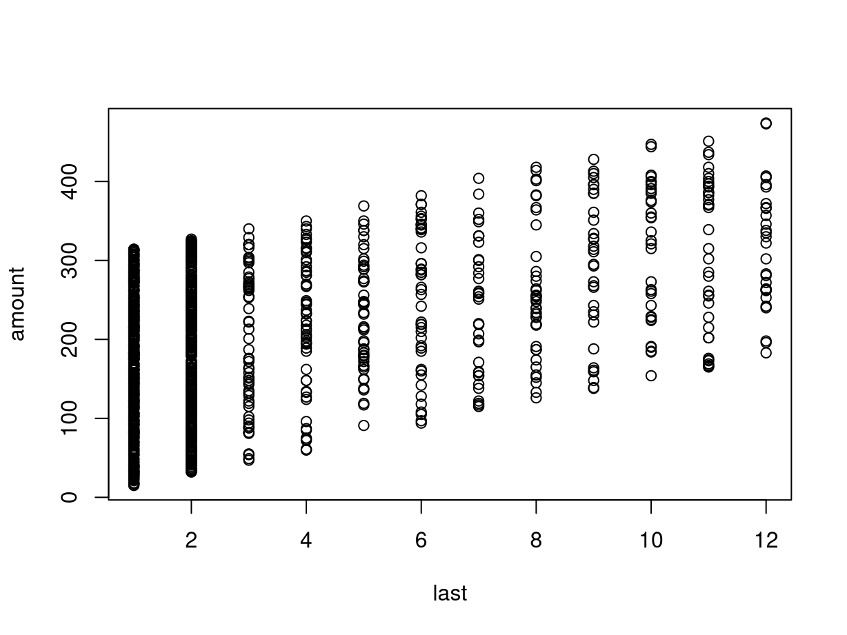
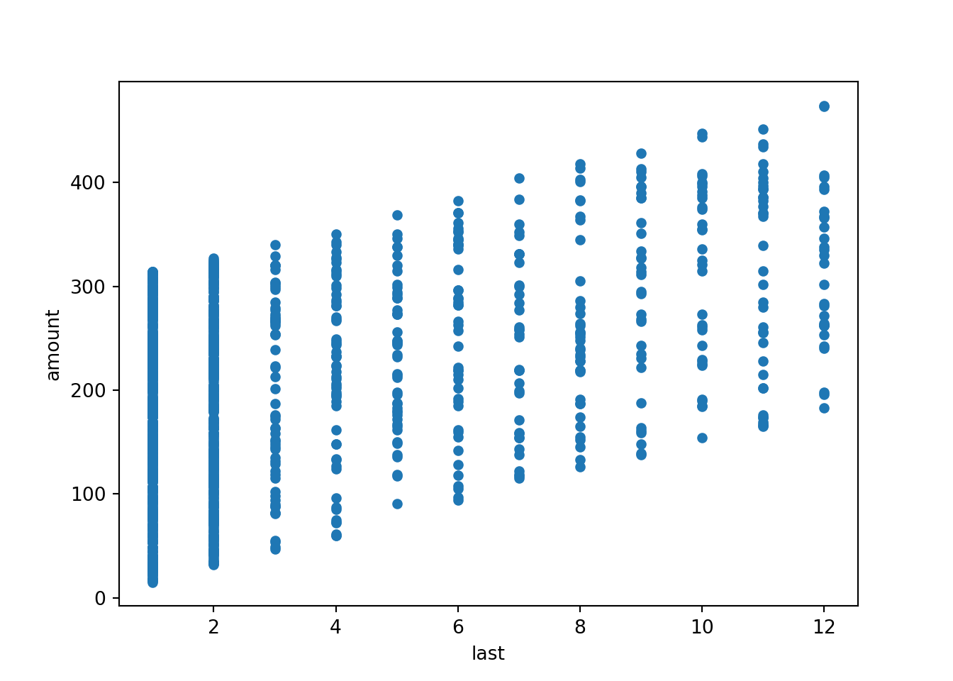
For the Bookbinders Book Club data we consider the association between the time
since the last purchase and the total amount purchased so far.
## [1] 0.452111These are positively correlated as customers who have been able to wait longer since their last purchase typically have purchased more (to fulfill the minimum purchase requirements of the book club).
This positive association can also be brought out graphically by the
corresponding scatter plot below. This also shows clearly that last is
actually discrete, leading to the vertical “stripes” in the plot.
R
The scatter plot can be generated in either of the two following ways:
In the latter call a so-called formula is used to specify the plot setup. The
~ operator can be read as “explained by”, i.e., amount explained by last in
this case. It has a number of advantages over the shorter plot(last, amount)
call:
- The relationship between the two variables is brought out more expressively by the formula which is also employed for specifying regression models.
- The same formula specification can be used when one or both of the variables
are qualitative rather than quantitative. The
plot()method then chooses an appropriate visualization technique automatically (see below). - The data does not need to be attached but can be specified by the
dataargument, making the call more self-contained.

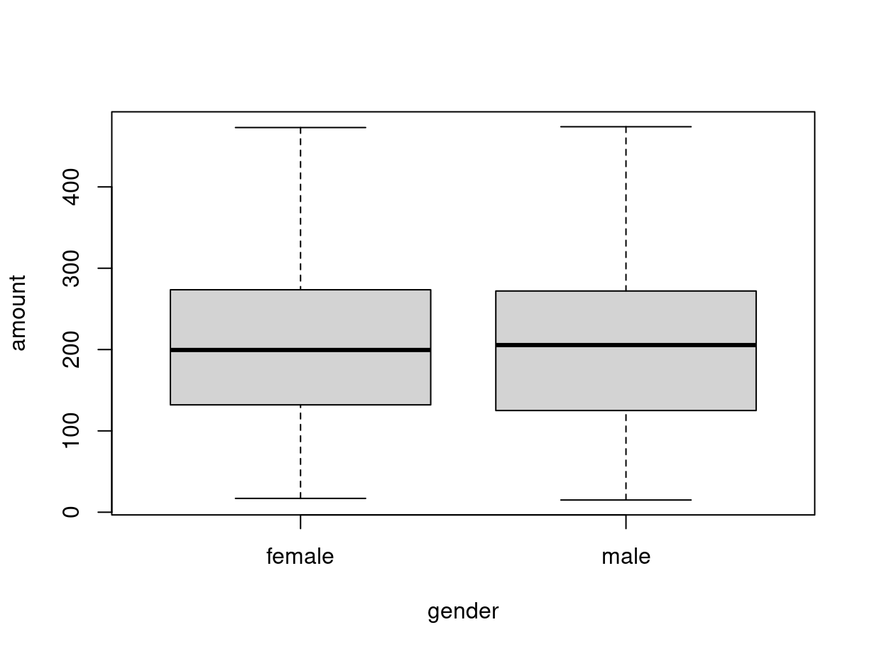
4.3.5 Dependent quantitative and explanatory qualitative variable
Visualization:
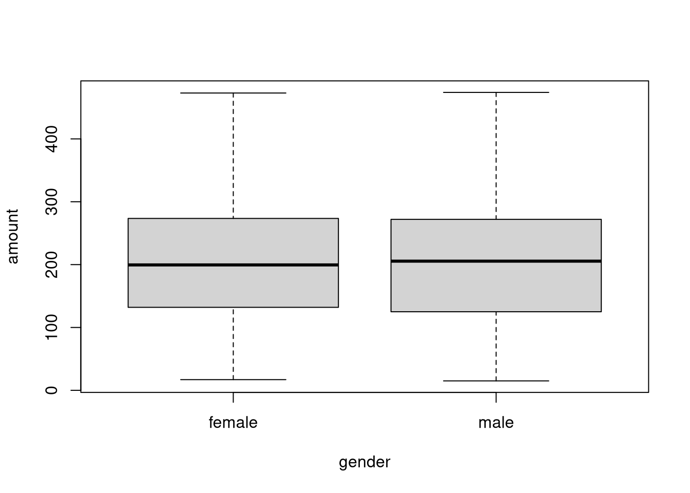
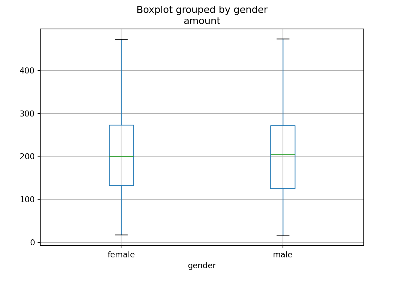
Here, it can be seen that the distribution of amount is essentially the same
across both gender groups. Neither group spends more or less on average.
The corresponding groupwise statistics can be computed with…
R
In R, the tapply() function is used. The call tapply(y, x, FUN) takes a dependent y variable, an
explanatory x variable, applies a FUNction in each of the x groups, and
reports the result as a table (hence the name tapply()). The function to be
applied in each of the subgroups can return a scalar or a vector value:
##  female    male
## 203.491 200.223## $female
## Min. 1st Qu. Median Mean 3rd Qu. Max.
## 17 132 200 203 273 473
##
## $male
## Min. 1st Qu. Median Mean 3rd Qu. Max.
## 15 125 206 200 272 474Instead of just providing a single x variable, it would also be possible to
provide a list() of explanatory variables. The function is then applied to
each possible combination of the explanatory variables.
The results reflect what the boxplots have already shown above: The distribution
of amount is essentially the same across both gender groups.
4.3.6 Two qualitative variables
The basic numeric description of the association between two qualitative
variables is always the corresponding frequency or contingency table. For illustration, we explore whether men or women (variable gender) are more likely to purchase the advertised art book (variable choice):
R
In R the table() function can be used to generate such contingency tables - or
alternatively the xtabs() function which has the advantage of a formula-based
interface. However, note that there is no dependent variable in the xtabs()
formula because all variables enter equally into the table.
##         choice
## gender    no yes
##   female 273 183
## male 627 217The raw absolute frequencies are hard to interpret because the two gender groups are not of equal size (about two thirds are men and one third women, see above). Several functions are available to visualize frequency tables.
R
R provides a number of functions that can transform and visualize frequency tables:
prop.table(): Compute relative frequencies of the overall table (default) or conditional on selected margins.margin.table(): Sum frequencies across slected margins, e.g., for row or column sums.ftable(): Print flat two-way tables based on underlying multi-way tables.mosaicplot(): Visualization of multi-way contingency tables based on recursively splitting rectangles along margins based on conditional relative frequencies for given previous margins. Allows flexible specification of split order, direction, spacing, shading, etc.spineplot(): Special case of the general mosaic display for two-way tables with a particular shading and spacing.
In the Bookbinders Book Club illustration, it is of interest how the conditional
frequency of choice (second margin) given gender (first margin) differs:
##         choice
## gender         no      yes
##   female 0.598684 0.401316
##   male   0.742891 0.257109
Clearly, the proportion of women purchasing the product (40.1%) is much higher than for the men (25.7%). The same can also be brought out by the corresponding mosaic plot or spine plot:

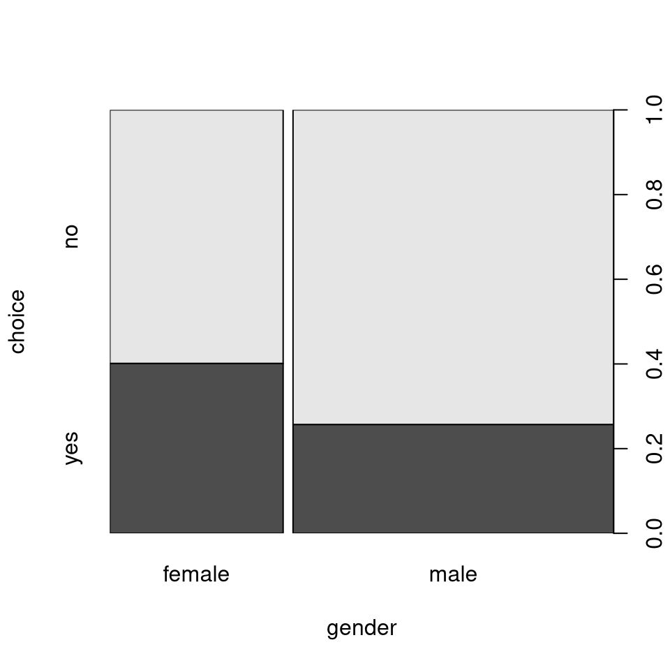
Note: To understand the construction of a mosaic/spine plot we can also take a
rectangle representing 100%, split it first vertically by the marginal
relative frequencies for gender, and then horizontally based on the
conditional relative frequencies of choice given gender:
The corresponding relative frequencies can be computed by hand via:
## choice
##       no      yes
## 0.692308 0.307692## choice
## gender no yes
## female 0.598684 0.401316
## male 0.742891 0.257109Furthermore, the spineplot() also provides a formula interface and is called
in the background by the general formula-based plot() method. Thus, the spine
plot for the Bookbinders Book Club can also be generated “as usual” (and as in
the sections above).
As a final remark, the spineplot() function (but not the plot() interface)
return the visualized frequency table invisibly. Thus, without calling table()
or xtabs() we can set up the plot and table above via:
Python
from statsmodels.graphics.mosaicplot import mosaic

# Reorder categories for mosaic plots
BBBClub['choice'] = BBBClub['choice'].astype('category');
BBBClub['choice'].cat.reorder_categories(['yes', 'no']);

grey_scale = lambda key: {'color': 'dimgrey' if 'yes' in key else 'lightgrey'} # Define a color map using lambda functionlambda key:

mosaic(data=BBBClub, index=['gender', 'choice'], properties=grey_scale, gap=0.02, statistic=True);
plt.show()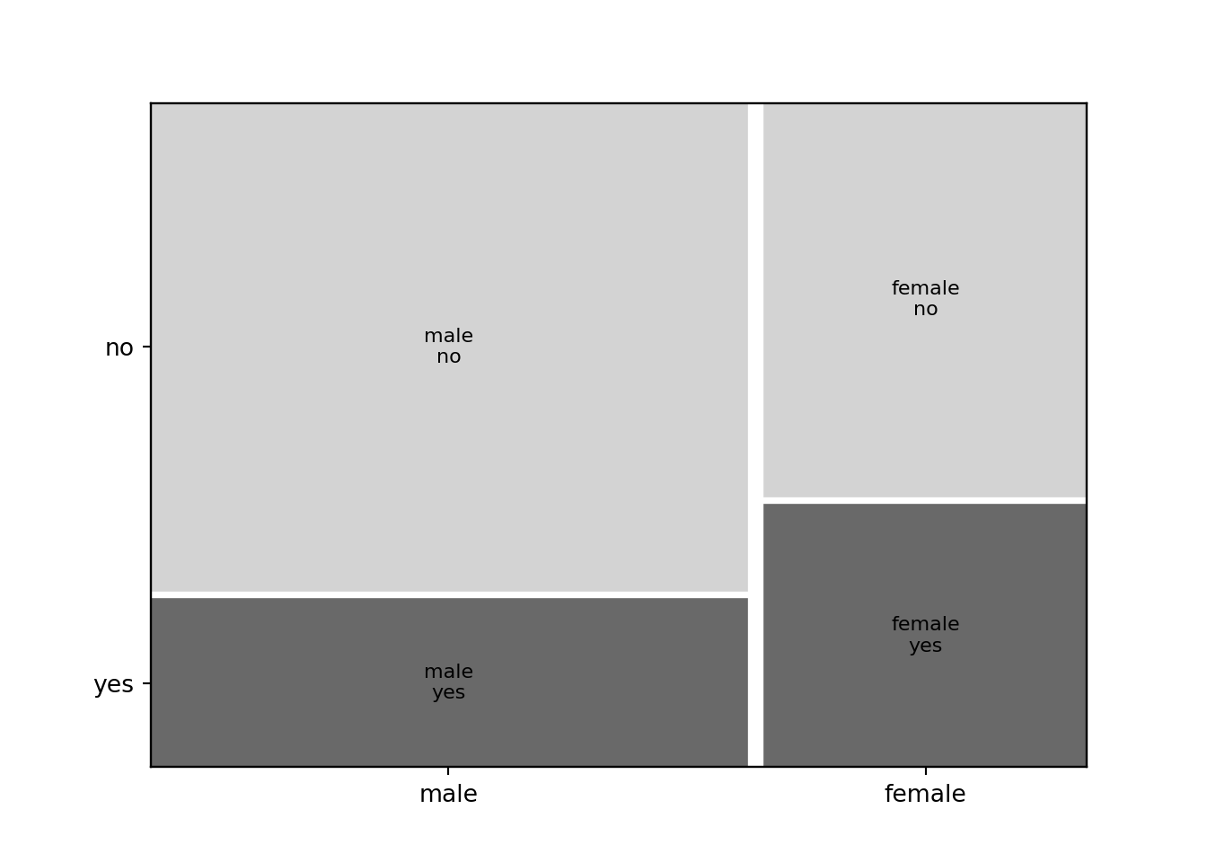
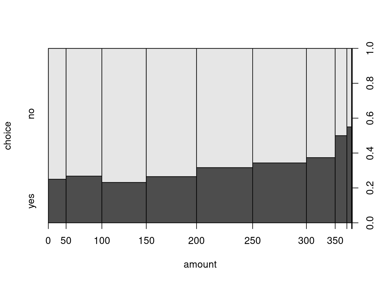
4.3.7 Dependent qualitative and explanatory quantitative variable
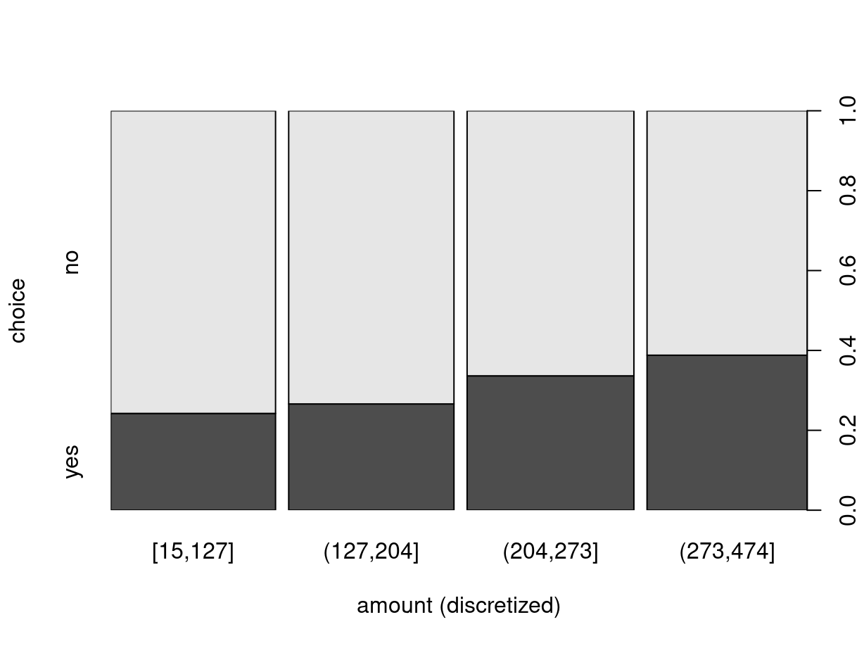
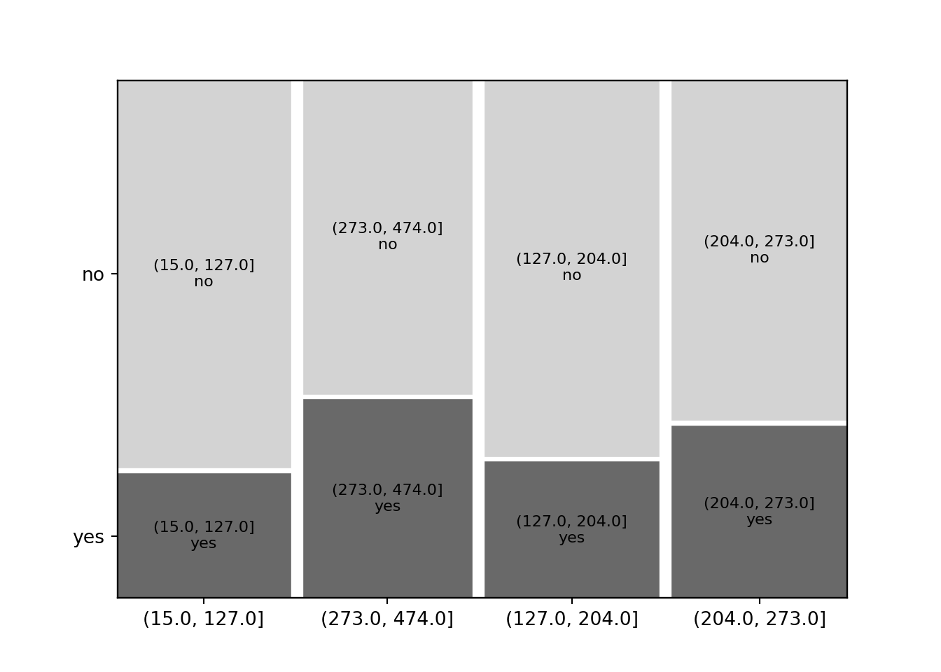
The situation with a dependent qualitative and explanatory quantitative variable is essentially handled like the setup with two qualitative variables by breaking the quantitative variable up into separate bins or intervals. This is essentially the same idea that the histogram uses for visualization.
R
For visualization, this handled automatically by the spineplot() function
which is again interfaced through the general formula-based plot() method. As
an illustration we show how the conditional purchase frequency for the
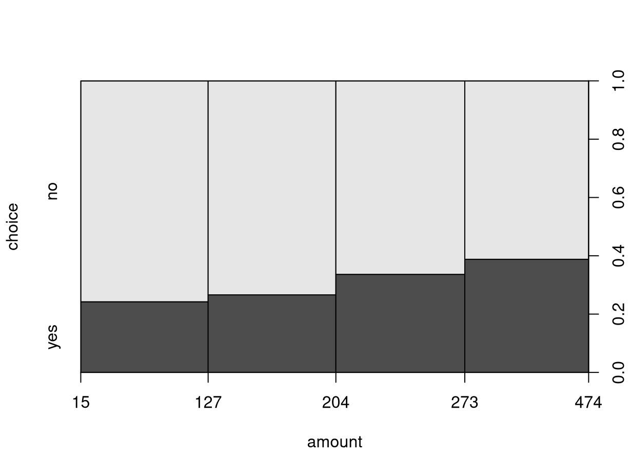
advertised art book (variable choice) increases along with total amount
spent so far:
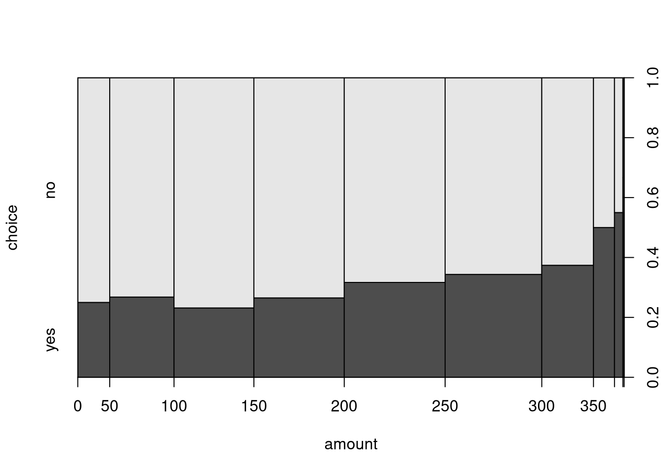
By default, the interval bins are chosen equidistantly as in hist(), yielding
a somewhat distorted x-axis. While the distance on the x-axis always corresponds
to fifty dollars, the marginal distribution differs substantially with amounts
between 100 and 300 being much more frequent (i.e., yielding wider bins).
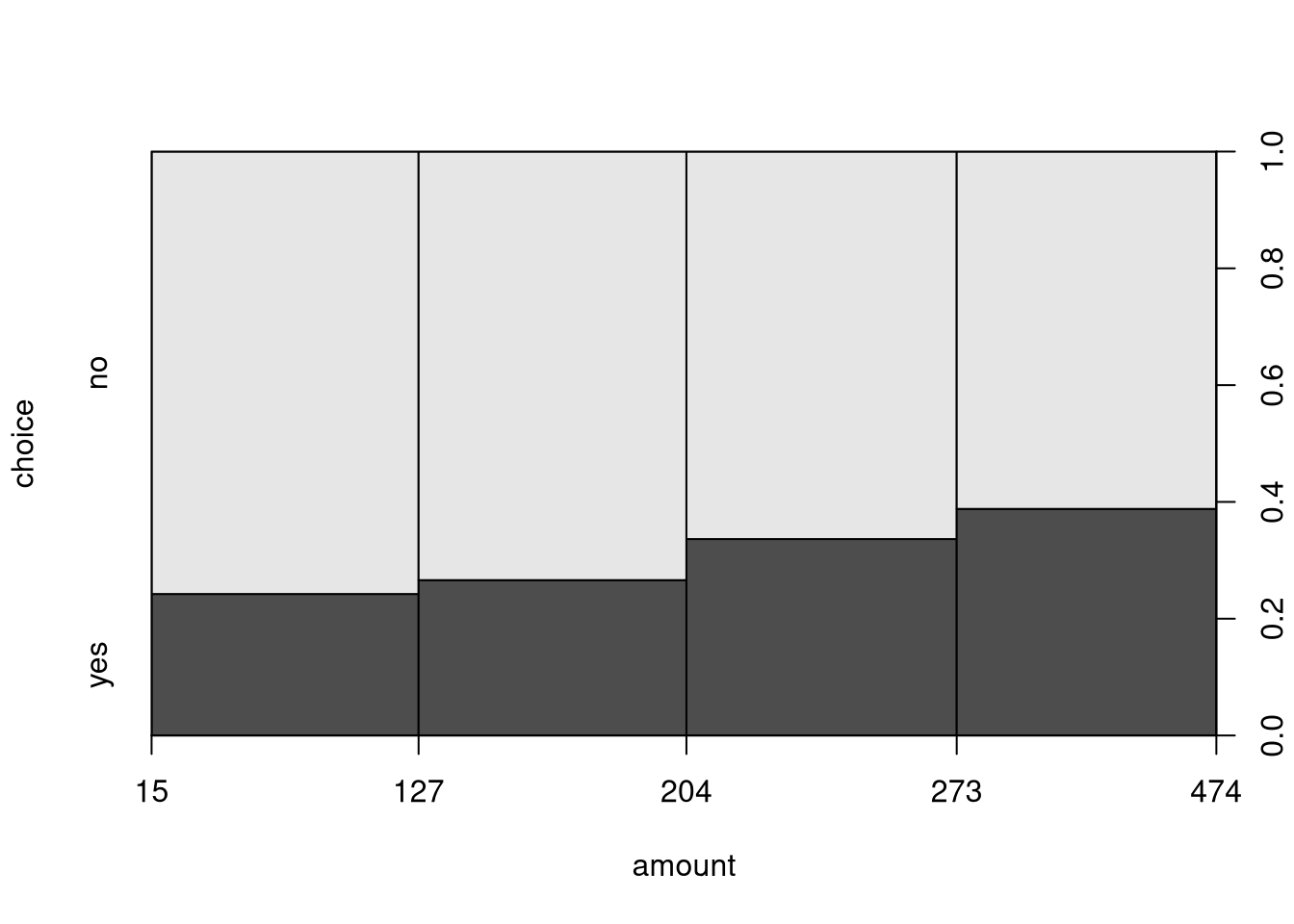
Alternatively, the breaks for the intervals can also be modified. For
illustration, we employ the five-point summary yielding bins that approximately
contain 25% of observations each (but are not equidistant on the dollar scale).
When calling spineplot() directly (rather than the plot() interface), the
underlying contingency table is again returned invisibly. It can also be
constructed “by hand” by first cut()-ting the amount variable to a factor
and then using table() and prop.table() as in the previous section.
##  [15,127] (127,204] (204,273] (273,474]
## 326 327 330 317## choice
## amount2 no yes
## [15,127] 247 79
## (127,204] 240 87
## (204,273] 219 111
## (273,474] 194 123## choice
## amount2 no yes
## [15,127] 0.757669 0.242331
## (127,204] 0.733945 0.266055
## (204,273] 0.663636 0.336364
## (273,474] 0.611987 0.388013Concluding remark
As argued initially: When attaching a data frame, one should be very careful to also detach it again before proceeding with other analyses. Otherwise, multiple attached data frames are a common source of confusion.
Python
BBBClub['amount_bin'] = pd.cut(BBBClub['amount'], fivenum(BBBClub['amount'])) # Bin 'amount' samples
mosaic(data=BBBClub, index=['amount_bin', 'choice'], properties=grey_scale, gap=0.02, statistic=True);
plt.show()
## count               1299
## unique                 4
## top       (204.0, 273.0]
## freq                 330
## Name: amount_bin, dtype: object## amount_bin choice
## (15.0, 127.0] no 246
## (127.0, 204.0] no 240
## (204.0, 273.0] no 219
## (273.0, 474.0] no 194
## yes 123
## (204.0, 273.0] yes 111
## (127.0, 204.0] yes 87
## (15.0, 127.0] yes 79
## Name: count, dtype: int64