Chapter 14 Exploratory Data Analysis
As an addition to the main course material, let us have a look at exploratory data analysis and how we can easily create numerical and graphical summaries. One of the strenghts of R plotting which we will make use of to visualize the information of the “cod.xlsx” data set.
As shown in the previous chapter, we load and prepare our data
set with the following lines of code, here put into a function
called prepare_cod_data():
# Custom function
prepare_cod_data <- function(file) {
    # Input sanity check.
    # 'file' must be character, length 1, and file must exist
    stopifnot(is.character(file), length(file) == 1, file.exists(file))
    # Loading the required library
    require("readxl")
    # Import/read the data set, convert to data frame
    x <- data.frame(read_excel(file))
    # Transform variables
    x <- transform(x,
                   prevalence = as.logical(prevalence),
                   area       = as.factor(area),
                   sex        = factor(sex, 1:2, c("male", "female")))
    # Remove all observations with missing values and return data set
    return(na.omit(x))
}

# Loading the data set
cod <- prepare_cod_data("cod.xlsx")
head(cod, n = 3)
## intensity prevalence area year depth weight length sex stage age
## 37 0 FALSE soroya 1999 51 1016 47 female 1 3
## 38 0 FALSE soroya 1999 51 1584 53 male 1 5
## 39 0 FALSE soroya 1999 51 1354 55 male 1 4In the following: We will look at single variables and pairs of variables.
- Exploratory analysis of a single numerical vs. categorical variable.
- Exploratory analysis of pairs of variables.
Data
- Numeric “response”: Fish
weightandlength. - Categorical “response”: Parasite
prevalence(logical) andarea(factor).
14.1 Single numeric
Numerical summary
Having numerical variables we have already seen a series of functions to investigate the values. This includes:
- Tukey’s five-number
summary()and sample mean. - Standalone functions:
mean(),median(),min(),max(), andfivenum(). - Arbitrary quantiles:
quantile(). - Measures of spread: Variance
var(), standard deviationsd(), inter-quartile range viaIQR().
##    Min. 1st Qu.  Median    Mean 3rd Qu.    Max.
## 38 798 1467 1741 2239 9990## variance standard_deviation
## 1858879.920 1363.407Calculate the quantiles \(0.3333\), \(0.6666\) (\(1/3\), \(2/3\)).
## 33.33333% 66.66667%
##      1034      1942
Which tells us that one third of all fishes weight less than 1034, one third of all fished betweeen 1034 and 1942, and one third more than 1942.
Graphical summary
Two ways to get graphical summaries of numeric variables are the histogram and boxplots. Allow to visualize the distribution of the data and to identify possible outliers.
par(mfrow = c(1, 2))
# Histogram with additional density estimate
hist(cod$weight, freq = FALSE)
lines(density(cod$weight), col = 2, lwd = 2)
# Boxplot
boxplot(cod$weight, main = "Weight histogram")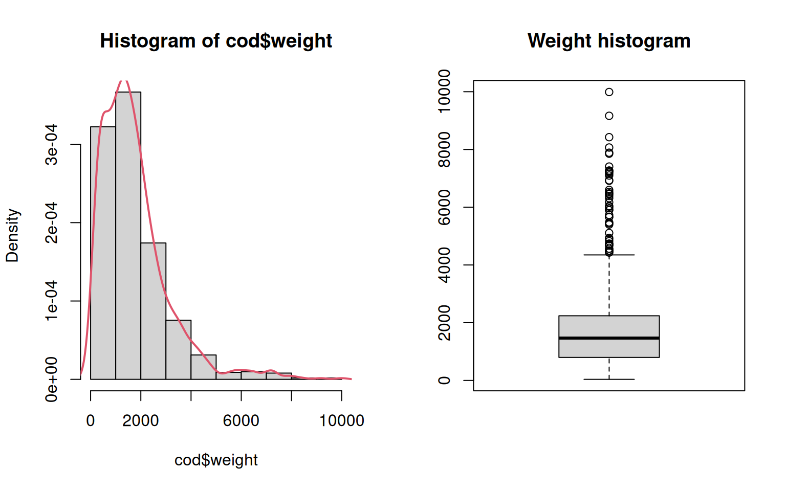
Details
- Density of
weight(i.e., area under curve equals \(1\)). - Default: Absolute frequencies, changed to density via
freq = FALSE. - Further fine tuning possible via selection of breaks .
- Added kernel density estimate (
density()). - The Box-and-Whisker shows the same information in a different way (more aggregated).
14.2 Single categorical
When having categorical variables (factor) the summary statistics/plots used
for numeric values are no longer meaningful. Whenever possible, the generic
functions of R take care of this. In addition, we might use additional
functions such as table(), xtabs(), and/or proportions().
Numerical summary
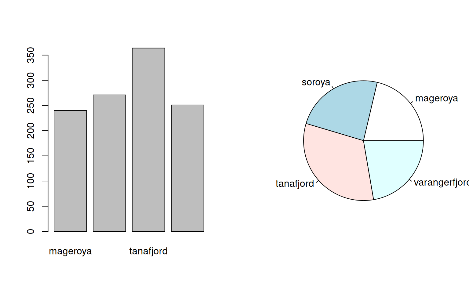
Let us have a look at:
- Frequency tables.
- Absolute vs. relative frequencies.
summary()vs. more flexibletable()or formula-basedxtabs().
##      mageroya        soroya     tanafjord varangerfjord
## 240 271 364 251##
## mageroya soroya tanafjord varangerfjord
## 240 271 364 251## area
## mageroya soroya tanafjord varangerfjord
## 240 271 364 251As shown, xtabs(~ area, data = cod) works the same way as table(cod$area) but
allows for more flexibility using the formula interface. We are interested
in the number of male and female fishes (sex) in each of the 4
areas in the data set:
##                sex
## area            male female
##   mageroya       117    123
##   soroya         144    127
##   tanafjord      176    188
##   varangerfjord  115    136
By default, table() and xtabs() give us absolute counts. If interested
in relative frequencies, proportions() can be applied on the return
(prop.table() for R versions before version 4).
##
##      mageroya        soroya     tanafjord varangerfjord
##     0.2131439     0.2406750     0.3232682     0.2229130
In case we have a table with more than only one dimension the proportions can be calculated over the entire object or along one of the dimensions.
##                sex
## area                 male    female
##   mageroya      0.1039076 0.1092362
##   soroya        0.1278863 0.1127886
##   tanafjord     0.1563055 0.1669627
## varangerfjord 0.1021314 0.1207815## sex
## area male female
## mageroya 0.4875000 0.5125000
## soroya 0.5313653 0.4686347
## tanafjord 0.4835165 0.5164835
## varangerfjord 0.4581673 0.5418327## sex
## area male female
## mageroya 0.2119565 0.2142857
## soroya 0.2608696 0.2212544
## tanafjord 0.3188406 0.3275261
## varangerfjord 0.2083333 0.2369338By multiplying the table by 100 you’ll get the percentages (relative
frequencies in percent).
14.3 Two numerical
What if we would like to analyze the relationship between two numeric values?
Numerical summary
Correlation coefficient(s) via cor(). Default is the
standard Pearson correlation coefficient, alternatives include the nonparametric
Spearman’s \(\rho\).
## [1] 0.9915759## [1] 0.9862109We can see that length and weight have a high correlation as expected as
bigger (longer) fishes are expected to be heavier than smaller ones.
We can see the advantage of using a log() transformation on both
variables in the next section when visualizing the relationship.
Graphical summary
We can also visualize this relationship using the generic X-Y plot.
plot(x, y)not using the formula interface.plot(y ~ x, data = cod)using the formula interface.- Using
log()transformation for the first two plots, while plotting non-transformed observations in the last sub-figure.
par(mfrow = c(1, 3))
# x: log-weight, y: log-length
plot(log(cod$weight), log(cod$length))
# Using the formula interface
plot(log(length) ~ log(weight), data = cod)
# Same but not log transformed
plot(length ~ weight, data = cod)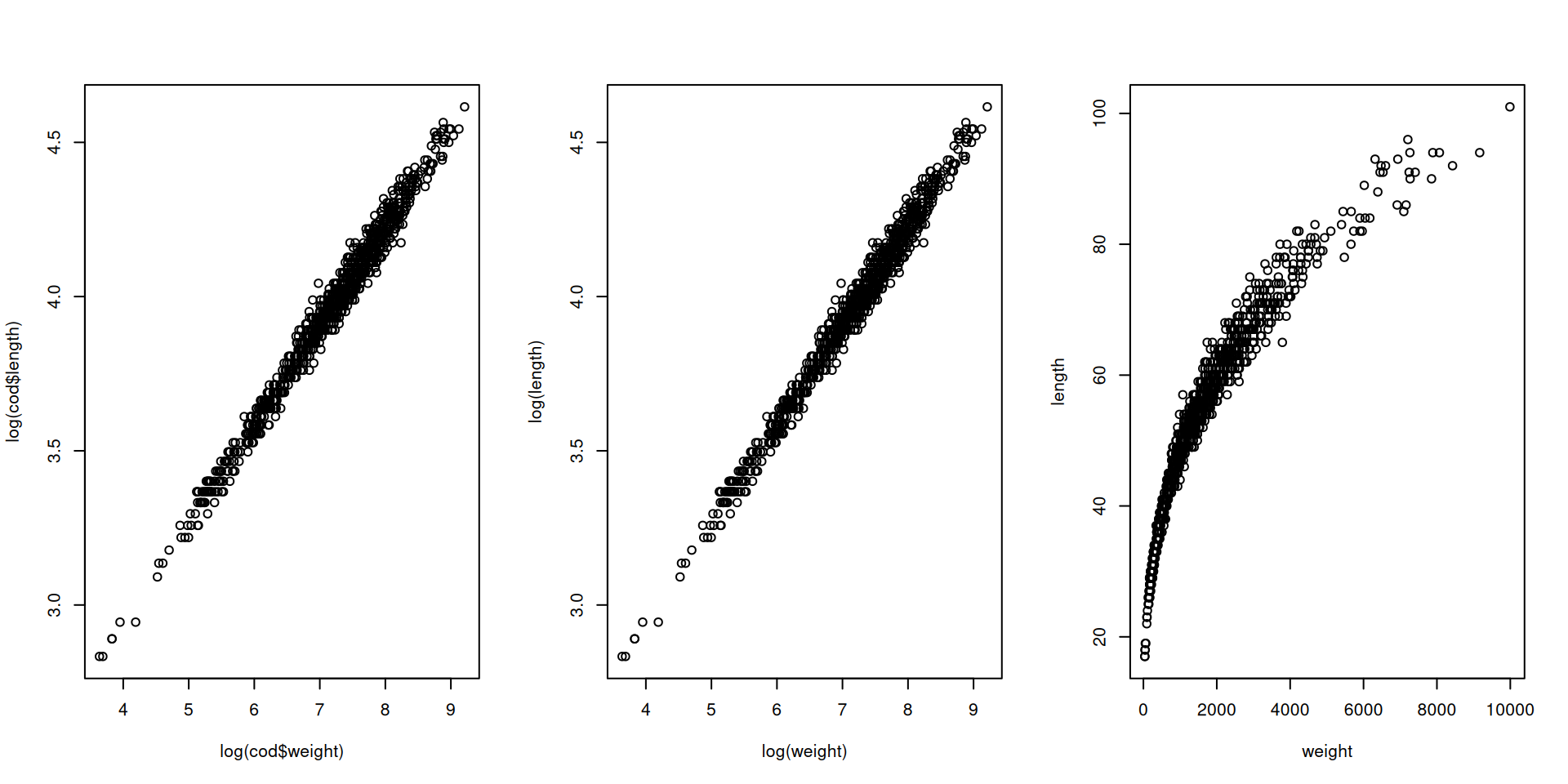
14.4 One numeric, one categorical
What if having one numeric variable (using weight) and one
categorical variable (area).
Numerical summary
What we can do is to calculate ‘grouped numerical summaries’ using
either tapply() or aggregate().
##      mageroya        soroya     tanafjord varangerfjord
## 7.257991 7.189640 7.171342 6.962064## area log(weight)
## 1 mageroya 7.257991
## 2 soroya 7.189640
## 3 tanafjord 7.171342
## 4 varangerfjord 6.962064Graphical summary
Plotting one numeric value (left hand side of the formula) given a categorical variable (right hand side).
par(mfrow = c(1, 2))
plot(log(weight) ~ area, data = cod)
plot(log(weight) ~ area, data = cod, varwidth = TRUE)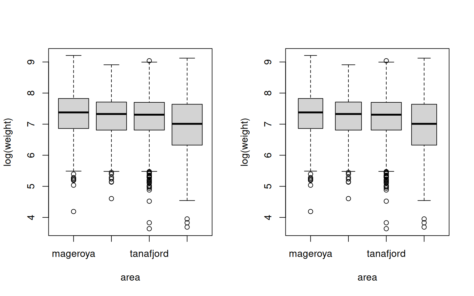
The boxplot
- Coarse graphical summary of an empirical distribution.
- Box indicates “hinges” (approximately the lower and upper quartiles) and the median.
- “Whiskers” indicate the largest and smallest observations falling within a distance of \(1.5\) times the box size from the nearest hinge.
- Observations outside this range are outliers (in an approximately normal sample).
Note that the two commands plot(y ~ x) and boxplot(y ~ x) both yield
the same parallel boxplot if x is a factor.
14.5 Two categorical
Last but not least let us have a look at the analysis of two categorical
variables. Let us use area (factor) and prevalence (logical). As the
latter one is a logical variable and not a factor we sometimes need to
turn it into a factor using factor(prevalence) below.
Numerical summary
- Contingency table(s) via
xtabs()(with formula interface) ortable(). - Conditional relative frequencies via
proportions(). - Logical as a factor with two levels (
TRUE,FALSE) intable()/xtabs().
##           area
## prevalence mageroya soroya tanafjord varangerfjord
##      FALSE      161    136       240            77
## TRUE 79 135 124 174## area
## prevalence mageroya soroya tanafjord varangerfjord
## FALSE 0.6708333 0.5018450 0.6593407 0.3067729
## TRUE 0.3291667 0.4981550 0.3406593 0.6932271Graphical summary
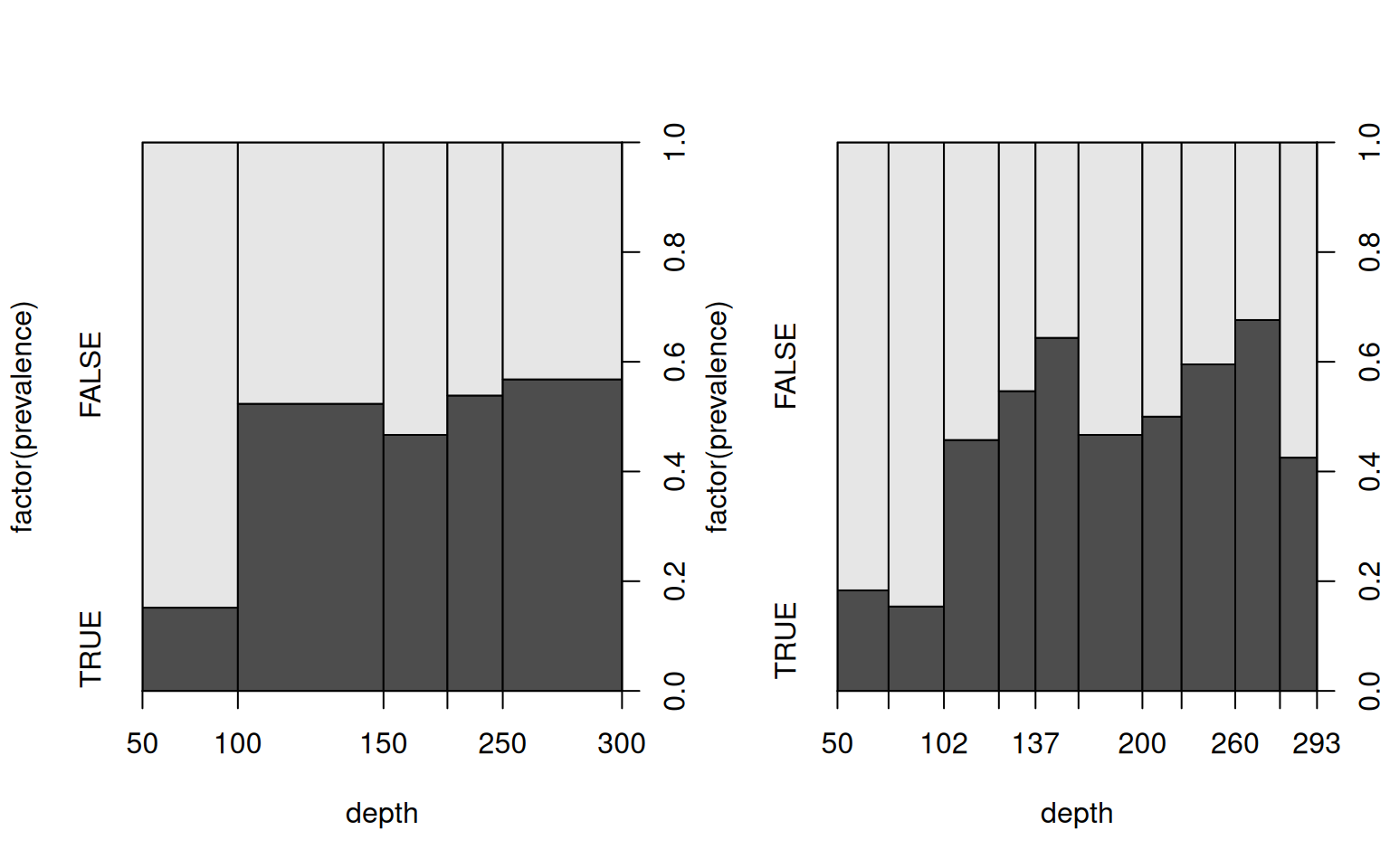
When having two categorical variables parallel boxplots will no longer work. Instead, R will create a so called mosaic plot.
A mosaic plot is a generalization of stacked barplots. The following variant is also called “spine plot”.
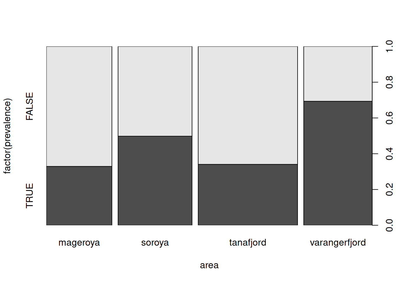
How to read: The heights of the bars correspond to the conditional
distribution of factor(prevalence) given area. The bar widths visualize the
marginal distribution of area.
If we plot a categorical variable against a numerical variable R will create a “Spinogram”. The Spinogram is a mosaic plot where R breaks he numerical variable into intervals (as in a histogram) and then employ the spine/mosaic plot as for two categorical variables.
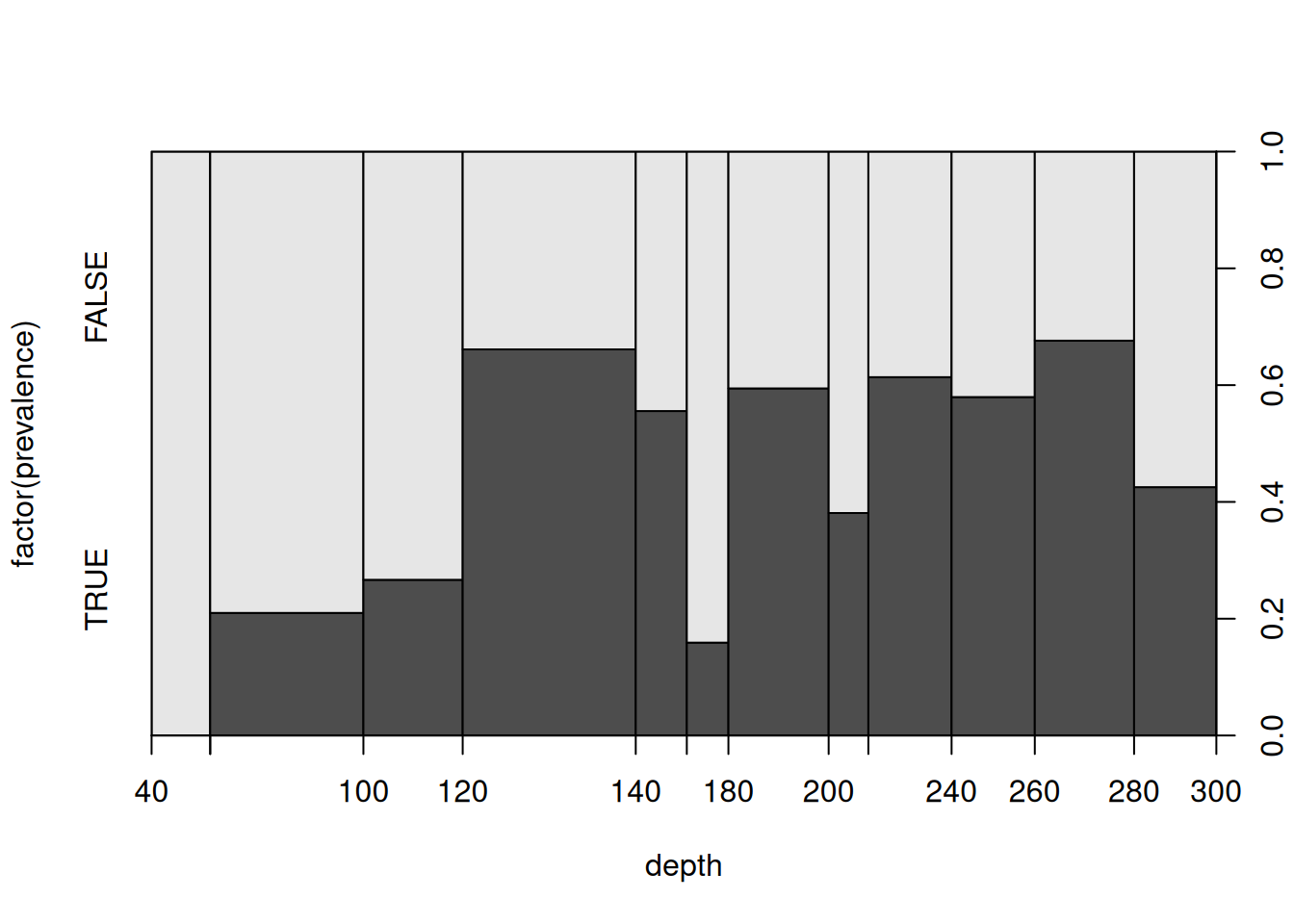
As in a histogram the breaks are by default equidistant using some heuristic. Alternatively, the approximate number of (equidistant) breaks can be supplied or the desired breaks (based on deciles, here).
par(mfrow = c(1, 2))
plot(factor(prevalence) ~ depth, data = cod, breaks = 8)
plot(factor(prevalence) ~ depth, data = cod, breaks = quantile(depth, 0:10/10))