Unsupervised Learning
The term unsupervised learning subsumes all kinds of algorithms that are used to gain insights from such an unlabeled data set. Typically these algorithms fall into three main categories:
Association rules: to discover relationships between different variables (e.g. for recommender systems: customers who bought X also bought Y)
Clustering: for grouping data based on their similarities (e.g. grouping news articles about similar topics)
Dimensionality reduction: for transforming data from a high-dimensional to a low-dimensional space (e.g. used for denoising images)
In this section we will quickly glimpse into clustering with an algorithm called K means, and into dimensionality reduction by applying PCA (Principal Component Analysis) and UMAP (Uniform Manifold Approximation and Projection).
Let us imagine that we only have a folder with 10.000 images of various hand written digits without any label and we would like to sort them into ten buckets: One bucket where we only have images of 0s, one bucket where we only have images of 1s and so on. Technically speaking, we are expecting to see ten different digits (categories) and within each category, the similarity between the images is expected to be high. How are we able to tackle this problem? One possibility is to sort them by hand. A less time consuming approach could be to apply some unsupervised learning algorithms.
Here we will work with MNIST's flattened test data set X_test which we prepared in the previous section. We could also use the training data set or merge both data sets, but samples are quite good already and we spare some computation time within the workshop. In practice we would go for the full data set of course.
In case you do not have X_test ready, look at the following code:
using MLDatasets

df_test = MNIST(:test)
X_test = reshape(df_test.features, (28 * 28, :))'
Clustering (K Means)
Theory
The K means algorithm is one of the most popular clustering methods. For a given set of observations , the algorithm strives to partition the observations into sets , such that the inner cluster variance is minimized. Formally, the goal is to find
where denotes the mean of the set .
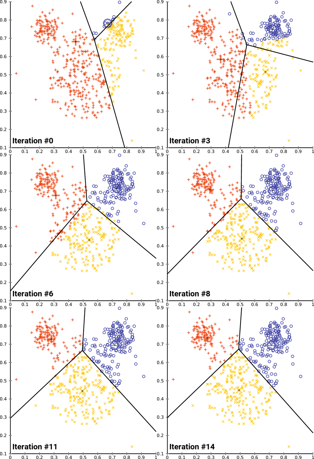
The naive algorithm works iteratively for a given :
Randomly initialize points , we call those points cluster centers.
Assign every point to the nearest cluster center . These points define the sets .
Calculate the mean within each set and replace the previous cluster centers.
Repeat until the cluster centers are stable (with some tolerance).
The following animation illustrates this process:
https://commons.wikimedia.org/wiki/File:K-means_convergence.gif
Application
Keep in mind that each row of X_test corresponds to one image and consists of values. If we imagine a -dimensional space, we could map a handwritten digit to a single point in that space and when we do this for every image in the test data set, we will end up with points in a -dimensional space. Hopefully, images containing the same digit will end up close to each other, because in this case we could successfully cluster them with K means. Since we have ten digits, we expect to find ten clusters and of course we do not have to program that algorithm all by ourselves.
MLJ introduction
Julia offers a nice machine learning meta package called MLJ.jl, which provides a common interface to over 160 machine learning algorithms. The basic workflow for using an unsupervised model is given by the following steps:
Loading the data
Loading the model
Instantiating the model
Transforming the data
Instantiating the machine (this is how
MLJ.jlcalls the object that combines the model with data)Fitting the machine/model by running
fit()on the machineOptionally: Transforming the data by applying the fitted model
MLJ application
The code for loading the data and model is straight-forward:
using DataFrames, MLDatasets, MLJ, ParallelKMeans

# Loading the data
df_test = MNIST(:test)
X_test = reshape(df_test.features, (28 * 28, :))'

# Loading the model
KMEANS = @load KMeans pkg=ParallelKMeans
KMEANS comes with several optional arguments. Unfortunately, MLJ.jl lacks documentation here:
help?> KMEANS
search: KMEANS kmeans kmeans_model mach_kmeans model_kmeans ParallelKMeans PKGMODE_MANIFEST

  ParallelKMeans model constructed by the user.
  See also the [package documentation](https://pydatablog.github.io/ParallelKMeans.jl/stable).
But simply initializing KMEANS with default arguments and having a look at the package's website gives some hints on how to parametrize the model:
julia> KMEANS()
KMeans(
  algo = Hamerly(),
  k_init = "k-means++",
  k = 3,
  tol = 1.0e-6,
  max_iters = 300,
  copy = true,
  threads = 1,
  rng = Random._GLOBAL_RNG(),
  weights = nothing,
  init = nothing)
Apparently k corresponds to the number of clusters, so we set this parameter to 10:
# initialize the model
model_kmeans = KMEANS(k=10)
For setting up the machine, we first need to know how to transform our data. MLJ.jl states that in general two-dimensional data is expected to be tabular and observations correspond to rows, not columns. Finally, specific models need specific scientific types as input. The second condition is already fulfilled for X_test. The first condition is easily fixed by calling X_test_tab = MLJ.table(X_test) and for the last condition, we need to check whether scitype(X_test_tab) is of type input_scitype(model_kmeans):
julia> X_test_tab = MLJ.table(X_test)
Tables.MatrixTable{LinearAlgebra.Adjoint{Float32, Matrix{Float32}}} with 10000 rows, 784 columns, and schema:
 :x1    Float32
 :x2    Float32
 :x3    Float32
 :x4    Float32
 :x5    Float32
 :x6    Float32
 ⋮
 :x780  Float32
 :x781  Float32
 :x782  Float32
 :x783  Float32
 :x784  Float32

julia> scitype(X_test_tab)
Table{AbstractVector{Continuous}}

julia> input_scitype(model_kmeans)
Table{<:AbstractVector{<:Continuous}}

julia> scitype(X_test_tab) <: input_scitype(model_kmeans)
true
Now we are ready to instantiate the machine and fit the model's parameters. In this case, transforming the data is not necessary, because we are only interested in the clusters' centers:
# Initializing the machine
mach_kmeans = machine(model_kmeans, X_test_tab)

# Fitting the model's parameters
fit!(mach_kmeans)
After fitting the model, we hopefully found ten representative cluster centers. With report(mach_kmeans), we can have a look at the training (fitting) results.
julia> r_machkmeans = report(mach_kmeans)
(cluster_centers = [0.0 0.0 … 0.0 0.0; 0.0 0.0 … 0.0 0.0; … ; 0.0 0.0 … 0.0 0.0; 0.0 0.0 … 0.0 0.0],
 iterations = 104,
 totalcost = 389412.2314496818,
 assignments = [1, 8, 6, 10, 2, 6, 1, 2, 2, 4  …  1, 9, 1, 10, 6, 5, 8, 4, 4, 3],
 labels = CategoricalArrays.CategoricalValue{Int64, UInt32}[1, 2, 3, 4, 5, 6, 7, 8, 9, 10],)
Please note the format of the cluster centers. We have ten clusters given in ten columns. Each column has entries, corresponding to one point in the high dimensional space:
julia> r_machkmeans.cluster_centers
784×10 Matrix{Float64}:
 0.0  0.0  0.0  0.0  0.0  0.0  0.0  0.0  0.0  0.0
 0.0  0.0  0.0  0.0  0.0  0.0  0.0  0.0  0.0  0.0
 0.0  0.0  0.0  0.0  0.0  0.0  0.0  0.0  0.0  0.0
 0.0  0.0  0.0  0.0  0.0  0.0  0.0  0.0  0.0  0.0
 0.0  0.0  0.0  0.0  0.0  0.0  0.0  0.0  0.0  0.0
 0.0  0.0  0.0  0.0  0.0  0.0  0.0  0.0  0.0  0.0
 ⋮                        ⋮
 0.0  0.0  0.0  0.0  0.0  0.0  0.0  0.0  0.0  0.0
 0.0  0.0  0.0  0.0  0.0  0.0  0.0  0.0  0.0  0.0
 0.0  0.0  0.0  0.0  0.0  0.0  0.0  0.0  0.0  0.0
 0.0  0.0  0.0  0.0  0.0  0.0  0.0  0.0  0.0  0.0
 0.0  0.0  0.0  0.0  0.0  0.0  0.0  0.0  0.0  0.0
Each of these points can be reshaped to its 2D representative and visualized. Here we provide the code to plot the -th cluster providing r_machkmeans:
using StatsPlots; gr()

function plot_clustercenter(report, i)
    cc = report.cluster_centers[:, i]  # get one cluster
    cc_reshaped = reshape(cc, 28, 28)    # reshape from flat to 2D
    return StatsPlots.plot(convert(Matrix{Gray}, cc_reshaped')) # Correctly rotate the image, transform to grey and show with StatsPlots
end
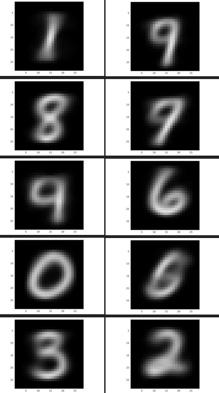
In our case the ten cluster centers look like this:

We can clearly recognize the numbers , , , , , , but obviously it is more difficult for numbers , , , . When looking closely, we see parts of the silhouettes too, but we are of course not completely happy with this fit. We might be able to grasp more of the underlying structure by increasing the number of clusters.
Dimensionality Reduction (Principal Component Analysis)
Theory
Simply speaking, the principal component analysis (PCA) is a technique used for reducing the dimensionality of data while preserving as much of the information that is contained in the original data. PCA does so by projecting the data points onto a lower-dimensional subspace while trying to keep the variance among the data set.
Technically speaking, the principal components are the eigenvectors of the data's covariance matrix.
The dimension of the original data is then reduced to by projecting the data using the first eigenvectors. Please note that the resulting projected data are essentially linear combinations of the original data which capture most of the variance in the original data.
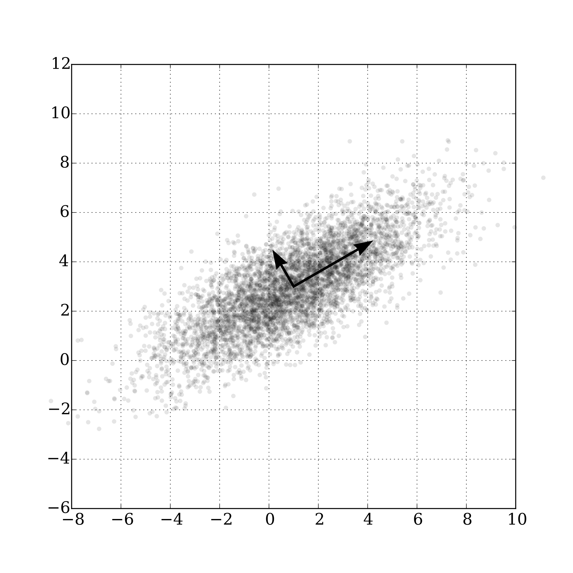
An illustration is shown here:

https://de.wikipedia.org/wiki/Hauptkomponentenanalyse#/media/Datei:GaussianScatterPCA.svg
Application
Since we decided to use MLJ.jl as a meta package, it would be easy to scale the data and also apply the PCA. For scaling the data we could use the Standardizer() which is part of MLJs built-in transformers.
In case you have a fresh REPL, you can start off with this code:
using DataFrames, MLDatasets, MLJ

df_test = MNIST(:test)

X_test = reshape(df_test.features, (28 * 28, :))'
X_test_tab = MLJ.table(X_test)

y_test = df_test.targets
But in our case standardizing the data leads to various problems:
Some pixels are always
0.The variance in a few pixels is very low.
And since we are working with "clean" image data, we want to keep every pixel on the same scale, so for convenience reasons we skip the standardizing here.
Standardizer of MLJ can be applied. But unfortunately, it scales each of the columns separately which we definitely do not want in our case.
# Instantiating the model
standardizer_model = Standardizer()

# Instantiating the machine (this is how `MLJ.jl` calls the object that combines the model with data)
mach_standardizer = machine(standardizer_model, X_test_tab)

# Fit model (compute mean and std)
fit!(mach_standardizer)

# Transform the data by applying the fitted model
X_test_scaled = MLJ.transform(mach_standardizer, X_test_tab)

# WARNING - THIS IS HACKY: X_test_scaled unfortunately contains NaNs. We replace them by 0. Therefor we first need to convert it to a data frame.
X_test_scaled = DataFrame(X_test_scaled)
X_test_scaled .= ifelse.(isnan.(X_test_scaled), 0, X_test_scaled)
But one could think of just standardizing over all the columns simultaneously.
We are now ready for applying the principal component analysis in the same fashion:
using MLJMultivariateStatsInterface

PCA = @load PCA pkg=MultivariateStats
pca = PCA()

mach_pca = machine(pca, X_test_tab)
fit!(mach_pca)
In case you get an exception MethodError: no method matching size(::MultivariateStats.PCA{Float64}, ::Int64) when running this code, be sure to add / update MultivariateStats to at least 0.9.1. There unfortunately seems to be a bug in 0.9.0.
We did not give a target dimension to PCA() so by default it is using as many dimensions as there are needed to preserve 99% of the variance of the original data (in our case we need 486 components). Before we look at the principal components, we are interested to check how the number of principal components relate to the explained variance ratios for our data sample. Therefore, we need to access the principalvars (a list of values) and divide by the total explained variance tvar. Both values are accessible in the report:
r_pca = report(mach_pca)

explained_variance_ratios = r_pca.principalvars / r_pca.tvar
We are interested in the explained variance for the first dimensions, so we need to compute the cumulative sum before plotting it and we are using the PlotlyJS backend for interactivity:
using StatsPlots; plotlyjs()

StatsPlots.plot(cumsum(explained_variance_ratios, dims=1))
We observe that we only explain around 10% of the variance with two dimensions and we need roughly 115 dimensions to explain 80% of the variance. With other words: our projection loses a lot of information, but we still give it a try and visualize the transformed data. Keep in mind that we are projecting 784 dimensions into a two-dimensional space.
X_test_pca = MLJ.transform(mach_pca, X_test_tab)

@df X_test_pca StatsPlots.scatter(:x1, :x2, alpha=0.5)
:x1 and :x2 are the names of the first two columns (principal components) in X_test_pca and alpha is added for transparency such that we get an idea about the density of the data points.
This might not seem to be very helpful at first, but in this case we actually have labeled data available and to demonstrate the power of PCA, we will use that labels to add ten colors to this plot. Each digit will get its own color in this plot:
@df X_test_pca StatsPlots.scatter(:x1, :x2, group=y_test, alpha=0.5, palette=:seaborn_bright)y_test contains our labels, group tells StatsPlots to use that labels for coloring and the palette is set to a colormap which distinguishes nicely between ten groups.
By clicking on the different labels, you are able to hide and show them. We recommend to have a look at pairs of colors. We see for example that there is quite some overlapping in 1s and 7s but hardly any overlap in 1s and 0s. So we expect learning algorithms to be easily able to discriminate between 1s and 0s while probably having a harder time distinguishing between 1 and 7. But still we have to keep in mind that we lost a lot of information when transforming to two dimensions, so probably we find a better method for our data set.
MLJ.jl, so we need to load UMAP.jl directly. Follow this steps to get a nice dimensionality reduction with UMAP:
Add and use
UMAP.jlumap()expects aMatrixas input. Luckily we already have that:X_test.But
X_testis stored in row wise fashion (each observation is one row).umap()expects a column-major matrix, so we need to transpose the matrix.Have a look at the manual of
umap, apply the function on the transposed matrix and reduce the dimension to . Note that this computation might needs a couple of minutes.Store the result in
X_test_umap_matand visualize the result withStatsPlots.scatter(X_test_umap_mat[1, :], X_test_umap_mat[2, :], group=y_test, alpha=0.3, palette=:seaborn_bright).Reuse the code for previous scatter plot but replace the coloring by the results of the K means clustering algorithm
r_kmachmeans.assignments.Compare the two scatter plots (note that the K means results found ten clusters but the naming of the clusters is arbitrary).
using UMAP

X_test_umap_mat = umap(Matrix(X_test)', 2)

StatsPlots.scatter(X_test_umap_mat[1, :], X_test_umap_mat[2, :], group=y_test, alpha=0.3, palette=:seaborn_bright)

StatsPlots.scatter(X_test_umap_mat[1, :], X_test_umap_mat[2, :], group=r_machkmeans.assignments, alpha=0.3, palette=:seaborn_bright)
Colored by real labels:
Colored by K means assignments:
Outlook
Sometimes, it might help to combine dimensionality reduction with a clustering algorithm. The previous exercise demonstrates that UMAP manages to separate the data quite nicely, even when going down to two dimensions. Alternatively, we could, for example, first reduce the dimension of the original data set to ten and then apply a clustering algorithm on this lower dimensional data.