Exploratory Data Analysis
Introduction
In most data science projects exploratory data analysis (EDA) is an essential first step. The primary aim is to analyze a given data set to summarize its main characteristics. Therefore, EDA often uses data visualization and statistical methods.
In this section, we will continue to work with the Stack Overflow survey data set as shown in the previous section Loading data. To summarize, the necessary steps to start with this section can be found in the code snippet below:
using CSV, DataFrames

selcols = ["Age", "Country", "ConvertedCompYearly", "DevType", "Employment", "Ethnicity", "Gender", "OrgSize", "YearsCode"]
df_survey = CSV.read("survey_results_public.csv", DataFrame; missingstring="NA", select=selcols)
Alternatively, we can also load the arrow-file which we created in the previous section:
using Arrow, DataFrames

df_survey = DataFrame(Arrow.columntable(Arrow.Table("survey.arrow")))
Data Wrangling
In a first step, let us get a descriptive overview over the data by applying describe(). Also note the additional arguments that are given to show() for displaying all rows and columns.
julia> show(describe(df_survey), allrows=true, allcols=true)
9×7 DataFrame
 Row │ variable             mean       min                       median   max                                nmissing  eltype
     │ Symbol               Union…     Any                       Union…   Any                                Int64     Type
─────┼──────────────────────────────────────────────────────────────────────────────────────────────────────────────────────────────────────────
   1 │ Employment                      Employed full-time                 Student, part-time                      116  Union{Missing, String}
   2 │ Country                         Afghanistan                        Zimbabwe                                  0  String
   3 │ YearsCode                       1                                  More than 50 years                     1798  Union{Missing, String31}
   4 │ DevType                         Academic researcher                System administrator;Senior Exec…     16955  Union{Missing, String}
   5 │ OrgSize                         1,000 to 4,999 employees           Just me - I am a freelancer, sol…     22713  Union{Missing, String}
   6 │ Age                             18-24 years old                    Under 18 years old                     1032  Union{Missing, String31}
   7 │ Gender                          Man                                Woman;Or, in your own words:           1153  Union{Missing, String}
   8 │ Ethnicity                       Biracial                           White or of European descent;Sou…      3975  Union{Missing, String}
   9 │ ConvertedCompYearly  1.18426e5  1                         56211.0  45241312                              36595  Union{Missing, Int64}
Since most columns are String types, there is not that much to see, but we still get a helpful impression about the number of missing fields. In the last section, we stated that we are interested to do a little study in terms of income, so missing values there are not really feasible. Let us remove these rows in an exercise.
dropmissing and use that function to drop every row that is lacking an entry in ConvertedCompYearly.
Hint: To not having to reload the initial data set whenever you make a mistake, it might be a good idea to create a backup first: backup_df = copy(df_survey). So later you can always bring it back by calling df_survey = copy(backup_df).
dropmissing!(df_survey, :ConvertedCompYearly)
After the previous exercise you should have rows in your data set.
Let us try to get an overview over the yearly compensation. Again we can use describe(), just on that column, to get a more detailed summary statistics:
julia> describe(df_survey, cols=:ConvertedCompYearly)
Summary Stats:
Length:         46844
Missing Count:  0
Mean:           118426.152890
Minimum:        1.000000
1st Quartile:   27025.000000
Median:         56211.000000
3rd Quartile:   100000.000000
Maximum:        45241312.000000
Type:           Int64
The arithmetic mean is a lot higher than the median which indicates that the data is heavily skewed to the right. 25% of the data appears to be smaller than and 75% of the data larger than . The maximum is given by an entry of over 45Mio and there are also participants with a yearly income of one Dollar.
Let us create some plots to gain deeper insights. We have already seen the use of Plots.jl before. In this section, we will switch to StatsPlots.jl (which is a drop-in replacement for Plots.jl) since on one hand it supports easy plotting of dataframes and on the other hand also offers additional statistical recipes.
Creating a boxplot is fairly simple using the @df macro:
using StatsPlots

@df df_survey boxplot(:ConvertedCompYearly)
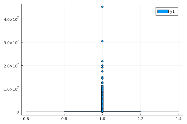
Apparently a couple of outliers totally screw our visualization. Fortunately, there is an undocumented function argument that allows us to get rid of the outliers within the visualization:
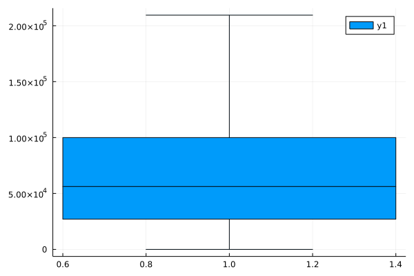
@df df_survey boxplot(:ConvertedCompYearly, outliers=false)So apparently around 50% of the developers earn to euros per year, the median being at about .

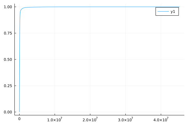
Let us also have a look at the cumulative distribution function (CDF) of our data column. Therefore, we simply sort the values of the column and plot them on the -axis while we scale the -axis from to .
julia> plot(sort(df_survey.ConvertedCompYearly), (1:nrow(df_survey)) ./ nrow(df_survey))
The plot tells us (just like the quartiles already indicated) that most of the survey participates earn a lot less than 10Mio. Dollars.
Removing outliers is a very controversial topic. Usually it is always good practice to try to understand the source of outliers and to consult a domain expert to decide whether or not to remove them. In this workshop we want to show the pitfalls when working with real data, but we also want to pragmatically clean the data to practice some data wrangling. So let us assume that it is very unusual for a software developer to earn more than 1Mio per year but to be sure, let us also check the entries where ConvertedCompYear exceeds 1Mio. We leave this as an exercise.
df_survey for entries where ConvertedCompYear exceeds 1Mio and have a look at the remaining data rows.
Hints: Check the manual of filter. When you are running your code in the Julia REPL within VS Code you will find a dataframe viewer in your Julia extension's workspace. Alternatively, it might also make sense to quickly write the dataframe to a CSV and have a look in one of the common spreadsheet programs.
df_topearners = filter(x -> x.ConvertedCompYearly > 1e6, df_survey)
Apparently, most of the top earners declared to be software developers. Let us filter the data set such that we only have entries Mio from now on.
df_survey for entries where ConvertedCompYear is equal or less than 1Mio.
filter!(x -> x.ConvertedCompYearly <= 1e6, df_survey)
Now you should have entries. Next, we only want to look at the DACH region.
df_survey for Country being Austria, Germany or Switzerland.
filter!(x -> x.Country in ["Austria", "Germany", "Switzerland"], df_survey)
Now we are down to entries. Have a look at the column Gender. Besides Man and Woman there are a lot more categories, but unfortunately with very little sample sizes. Thus, adding these to further visualizations would lead to misleading conclusions. It would require additional engineering to address these little sample sizes and therefore this is out of scope of this workshop.
So instead, let us also add a filter in this column.
df_survey for Gender being Man or Woman.
filter!(x -> !ismissing(x.Gender) && (x.Gender in ["Man", "Woman"]), df_survey)
You should now see entries. In a final step, let us convert the compensation from dollars into euros and store this information in a column named EuroCompYearly. As of July 1st, 2022, one Dollar corresponds to Euros:
df_survey[!, :EuroCompYearly] = 0.96 * df_survey[!, :ConvertedCompYearly]Here you find the solution for all manipulating tasks in this section.
using CSV, DataFrames

selcols = ["Age", "Country", "ConvertedCompYearly", "DevType", "Employment", "Ethnicity", "Gender", "OrgSize", "YearsCode"]
df_survey = CSV.read("survey_results_public.csv", DataFrame; missingstring="NA", select=selcols)

dropmissing!(df_survey, :ConvertedCompYearly)

filter!(x -> x.ConvertedCompYearly <= 1e6, df_survey)
filter!(x -> x.Country in ["Austria", "Germany", "Switzerland"], df_survey)
filter!(x -> !ismissing(x.Gender) && (x.Gender in ["Man", "Woman"]), df_survey)

df_survey[!, :EuroCompYearly] = 0.96 * df_survey[!, :ConvertedCompYearly]
Case Studies
Continuing with the same data set, let us conduct some case studies in the upcoming exercise.
What is the number of Austrian, German and Swiss survey participants.
Use
groupby,combineandnrow.Use
countmapof theStatsBase.jlpackage.
How does the median salary compare between full-time employments and independent contractors in Austria. Hint:
Statistics.jlprovides amedianfunction.How does the median salary of data scientists compare to non data scientists in the DACH region. Hint: Have a look at
occursinandtransform.How many data scientists per country are left in our data set?
julia> combine(groupby(df_survey, :Country), nrow => :count)
3×2 DataFrame
 Row │ Country      count
     │ String       Int64
─────┼────────────────────
   1 │ Austria        437
   2 │ Germany       3095
   3 │ Switzerland    529

julia> using StatsBase

julia> countmap(df_survey.Country)
Dict{String, Int64} with 3 entries:
  "Switzerland" => 529
  "Germany"     => 3095
  "Austria"     => 437
julia> using Statistics
julia> combine(groupby(filter(x -> x.Country == "Austria", df_survey), :Employment), :EuroCompYearly => median)
4×2 DataFrame
Row │ Employment EuroCompYearly_median
│ String? Float64
─────┼──────────────────────────────────────────────────────────
1 │ Independent contractor, freelanc… 74718.7
2 │ Employed full-time 54481.0
3 │ Employed part-time 31282.6
4 │ missing 31127.0julia> transform!(df_survey, :DevType => ByRow(x -> !ismissing(x) && occursin(x, "Data Scientist")) => :isdatascientist)
julia> combine(groupby(df_survey, :isdatascientist), :EuroCompYearly => median)
2×2 DataFrame
Row │ isdatascientist EuroCompYearly_median
│ Bool Float64
─────┼────────────────────────────────────────
1 │ false 64028.2
2 │ true 78451.2julia> combine(groupby(df_survey, [:Country, :isdatascientist]), nrow => :count)
4×3 DataFrame
Row │ Country isdatascientist count
│ String Bool Int64
─────┼─────────────────────────────────────
1 │ Austria false 437
2 │ Germany false 3088
3 │ Germany true 7
4 │ Switzerland false 529Data Visualization
In this workshop we have already used Plots.jl and StatsPlots.jl a couple of times to visualize functions and data. It may come to a surprise that Plots.jl and StatsPlots.jl are actually no plotting packages. They are rather plotting metapackages which provide an interface over many different plotting libraries. The specific plotting library that is actually being used to create the plots is referred to as the backend and it is easy to switch and therefore to use different plotting libraries. So far we always used the default backend GR which is fast, but lacks interactivity. Depending on the requirements you might like to try PlotlyJS.jl for interactivity or PyPlot.jl because you like the functionality of Matplotlib (known from Python). To get a good overview, have a look at the Plots.jl documentation.
In the last section we used methods from DataFrames.jl and Statistics.jl to do some case studies. Now we will supplement the studies with visualizations.
Barplot: Show survey participants by country
In a previous exercise we already used countmap to get a dictionary which summarizes the number of participants per country. Fortunately, StatsPlots.jl is able to visualize this dictionary immediately. We will also switch the backend to plotlyjs, so we are able to interact with the graph and get more detailed information about the height of the bars by moving our mouse cursor over the top of the bars and looking at the hover label.
julia> using StatsBase

julia> using StatsPlots; plotlyjs()
Plots.PlotlyJSBackend()

julia> countmap(df_survey.Country)
Dict{String, Int64} with 3 entries:
  "Switzerland" => 529
  "Germany"     => 3095
  "Austria"     => 437

julia> @df df_survey bar(countmap(:Country), legend=false)
Boxplot: Salary in comparison to employment status
Boxplots are a nice tool to visualize some distributional characteristics (locality, spread, skewness) of a given data sample. Dividing the data set into different groups allows an easy comparison.
In the following plot we compare the salary of different employment states:
@df df_survey boxplot(:Employment, :EuroCompYearly, xrotation=30, size=(500, 900), legend=false)We also used some optional arguments:
xrotation=30such that -axis labels do not overlap,size=(500, 900)such that the rotated labels are not cut off,legend=falseto disable the legend.
The filled area of the boxes correspond to the 25% to 75% quantiles of the data, so 50% of the data samples live within the filled area. The whiskers capture 1.5 times the interquartile range () and every data point that lies outside the whiskers is considered to be an outlier. The horizontal line inside the filled area corresponds to the median of the subset.
Please note that we create the figure using plotly, so the plot is interactive and you are able to zoom in and get additional information by pointing at certain details.
Since visualizations usually condense information up to some extend, it is always a good idea to look at the data from different perspectives. Adding e.g. a dots plot (where every sample is visualized by a dot) shows that two of the groups have only very little sample sizes.
@df df_survey boxplot(:Employment, :EuroCompYearly, xrotation=30, size=(500, 900), legend=false)
@df df_survey dotplot!(:Employment, :EuroCompYearly, legend=false)
Combining the information of the two plots we obviously have too little data to judge about the empty and I prefer not to say category. Also it appears that the average salaries of freelancers are a lot higher than the salaries of employees. Also the 25% quantile of freelancers is comparable to the median salary of full-time employees.
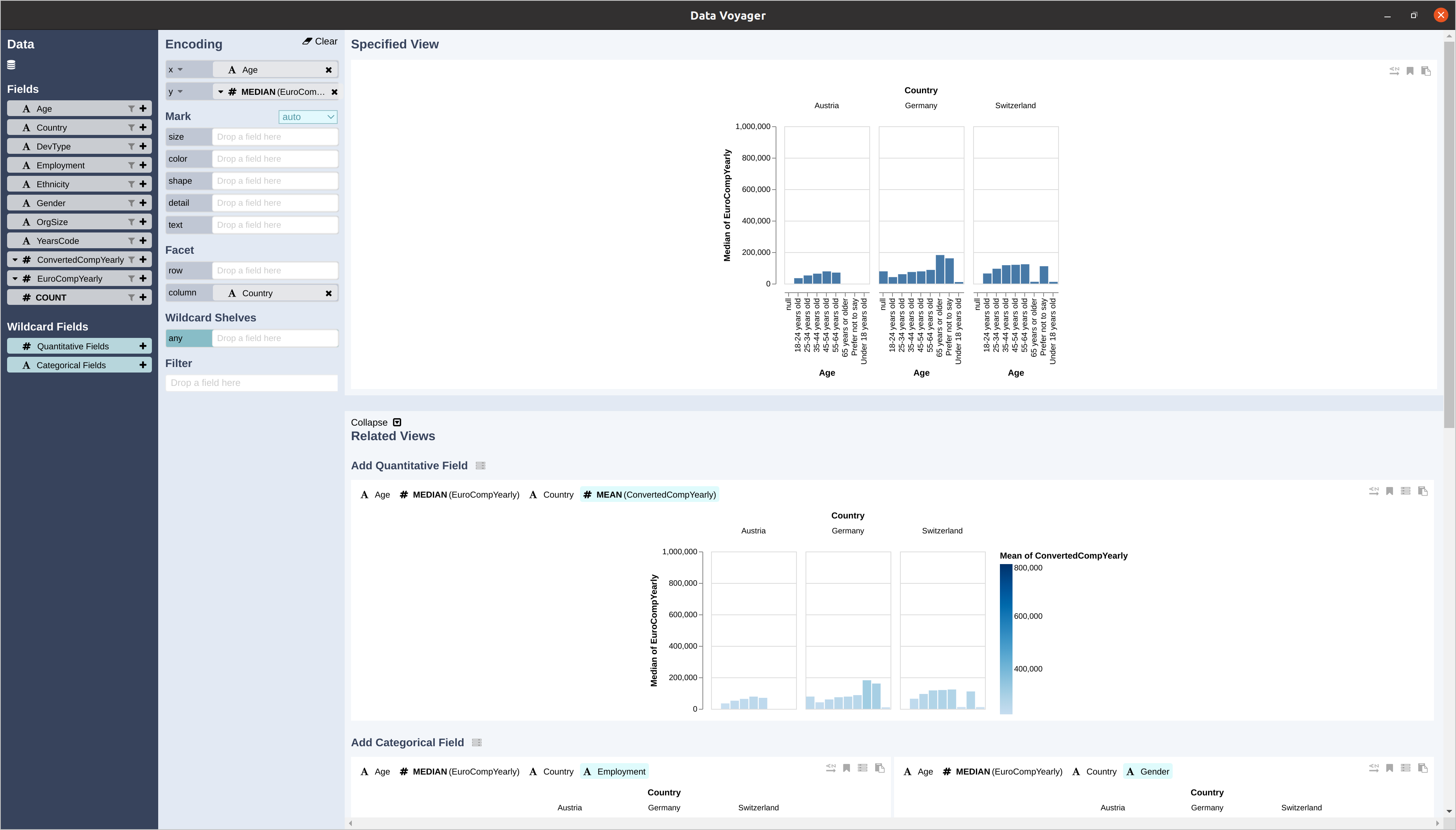
names(df_survey)). Have a look at the StatsPlots.jl documentation, get creative and generate some nice visualizations. Of course there are many different plot types you can choose from. Have a look at the Plots.jl gallery to get an overview. With DataVoyager.jl there is also a nice package that allows to interactively explore your data by loading a given dataframe into the Voyager data exploration tool:
using DataVoyager
v = Voyager(df_survey)
Here is a screenshot that shows this tool in action: 
DataVoyager.jl.